Vorwerk
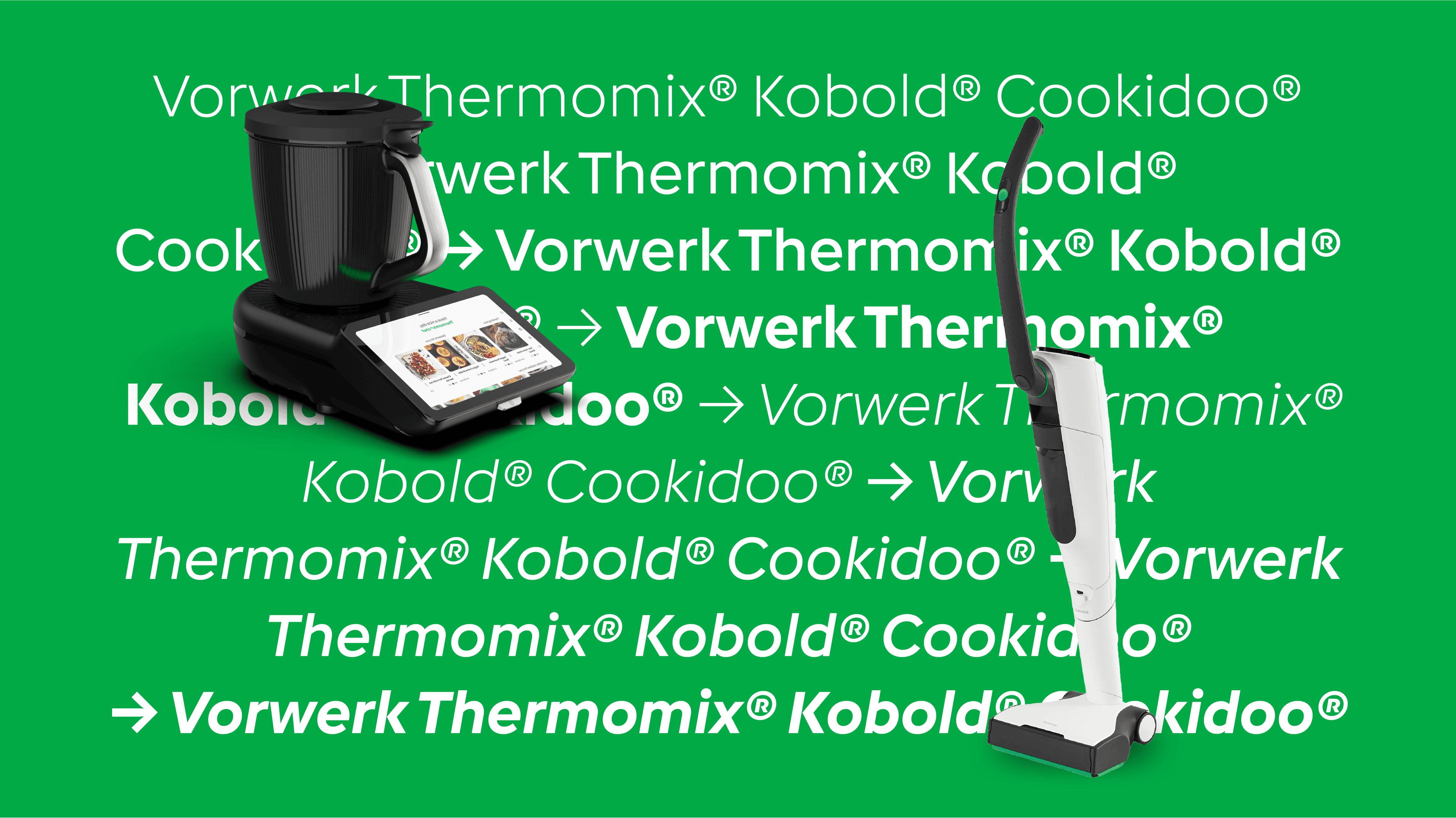
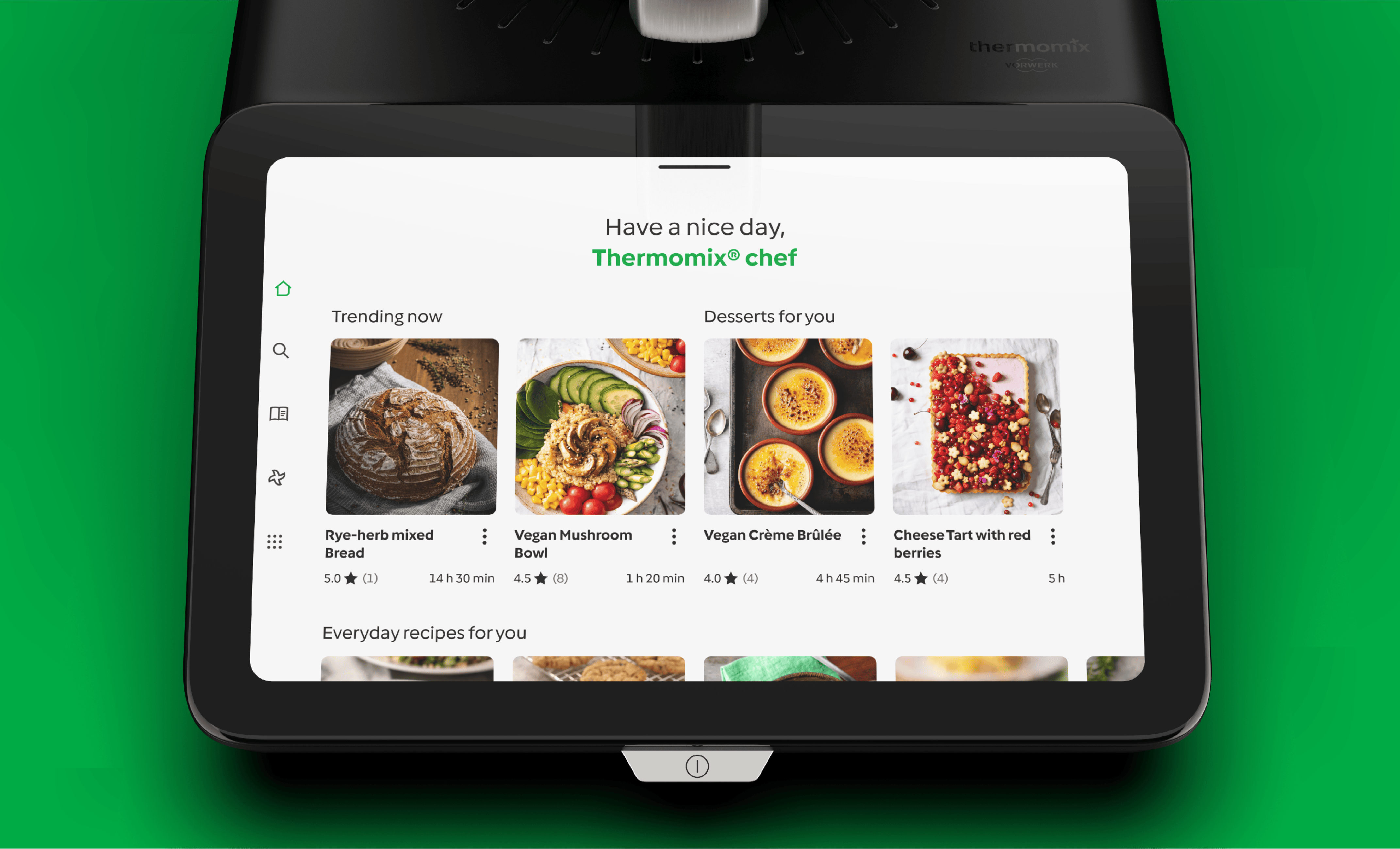
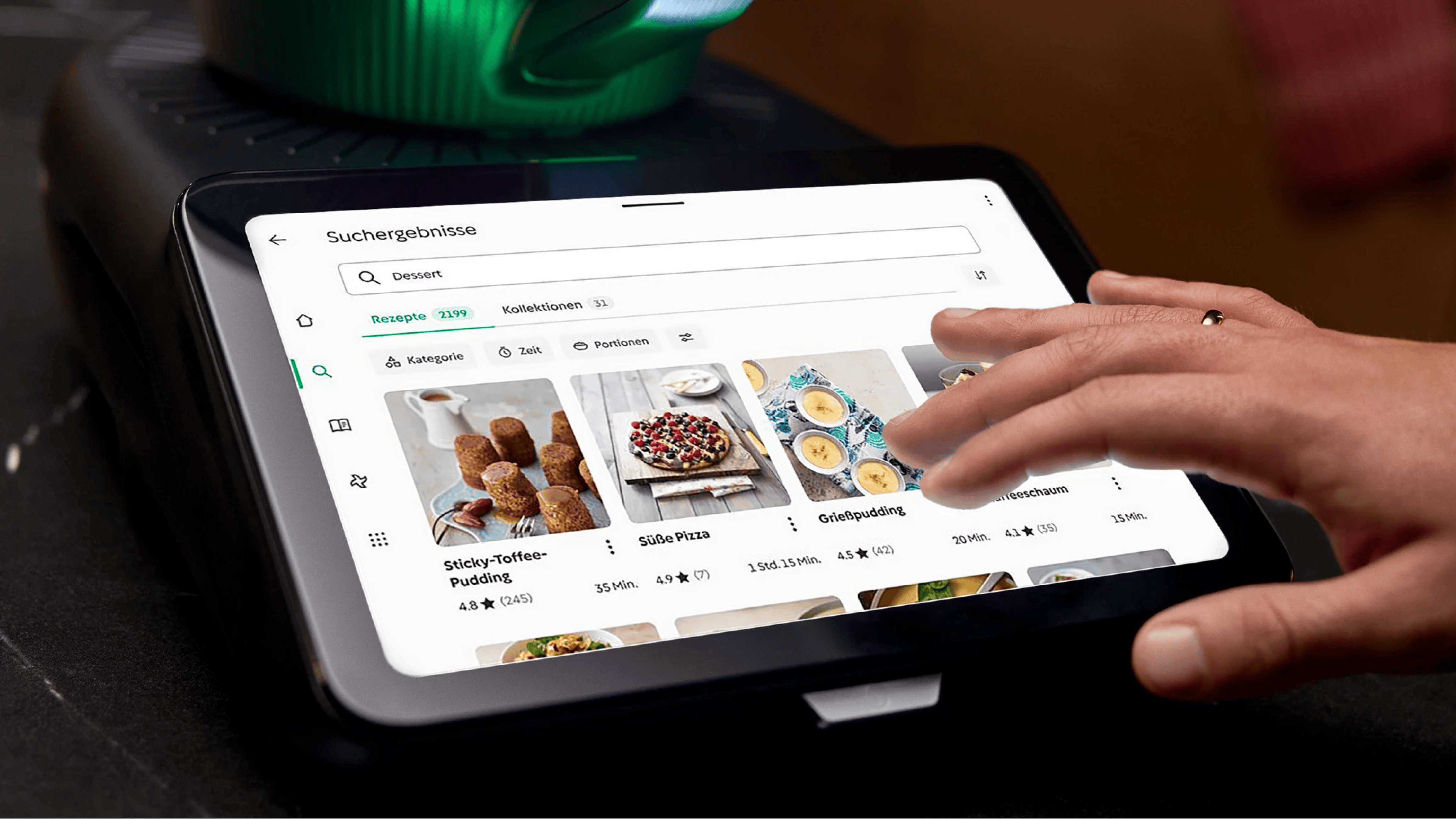
Vorwerk, founded in 1883 and headquartered in Wuppertal, Germany, is a global direct distribution business for household appliances such as Thermomix®, a kitchen appliance, and Kobold® vacuum cleaners as well as various other products. Character Type created a geometric typeface family with an extensiv glyph set (1.521 glyphs) covering 311 languages (Latin, Cyrillic and Greek). Designed with a keen eye towards text economy the geometric Vorwerk typefaces turned out to be nearly as space saving as Roboto Sans.
Type Design: Anja Meiners
Creative Direction – Heike Wilhelm, Johannes Franke, Consulting Director – Moritz Thauer

The Pointed Corner
We implement the pointed corners from the Vorwerk logo (the arches, R and K) into the typeface.
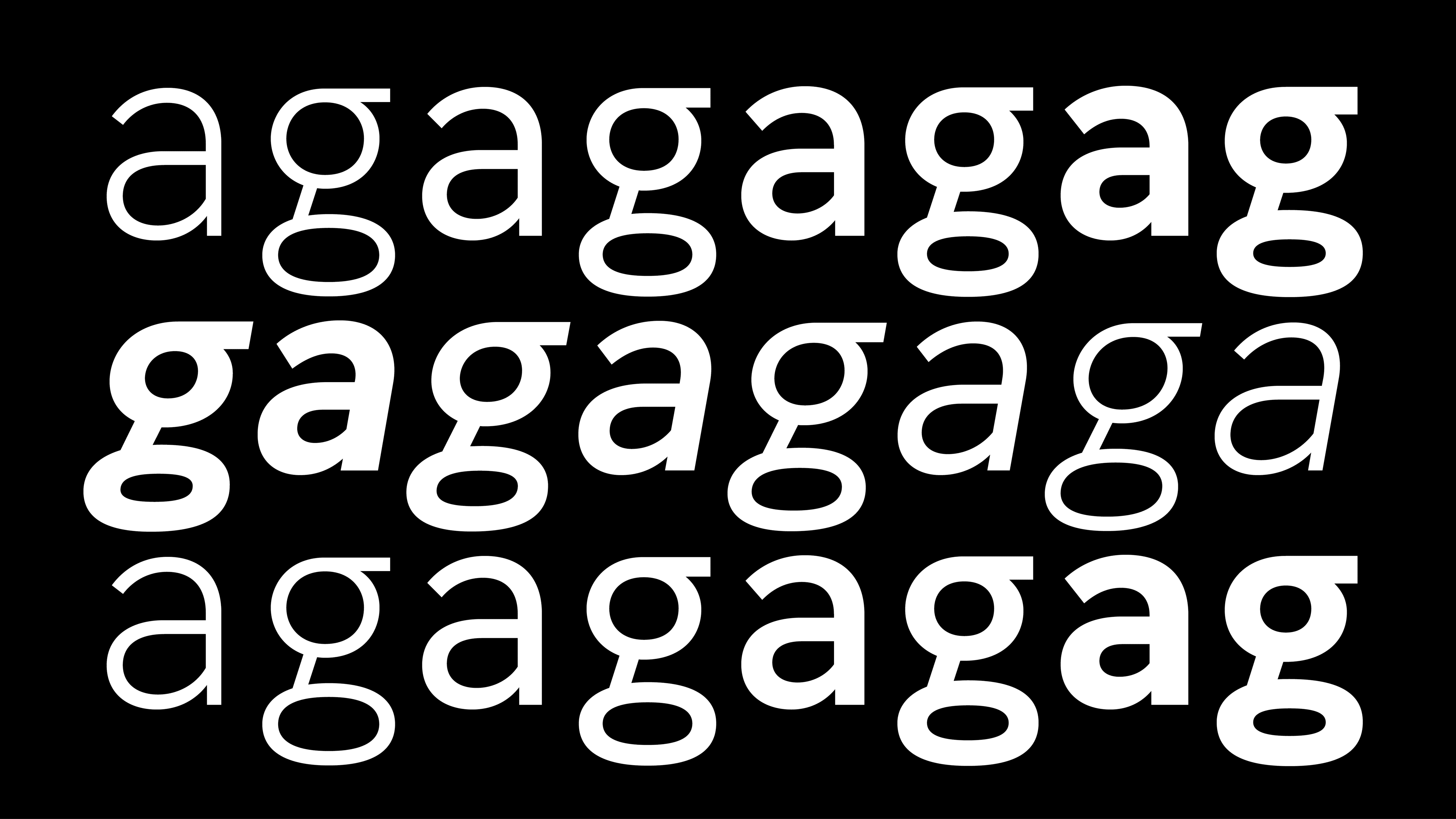
»a« & »g«
a and g are formative letters within the alphabet. A) because of their shear amount of usage they shape the general impression of a typeface. B) because of their construction. With three and respectively four horizontals in their set up they are plainly special.
Design Elements
The quarter circle is a key design element in the Vorwerk branding. It is found in the Vorwerk logo and in various other design elements. Hence it was also incorporated into the typeface design.
The Vorwerk character set contains 1.500+ glyphs and covers 311 languages and contains Latin, Cyrillic and Greek scripts. It is thereby completely interchangeable with Roboto Sans a typeface used previously by Vorwerk. This makes the implementation of the new typefaces safe and fast.
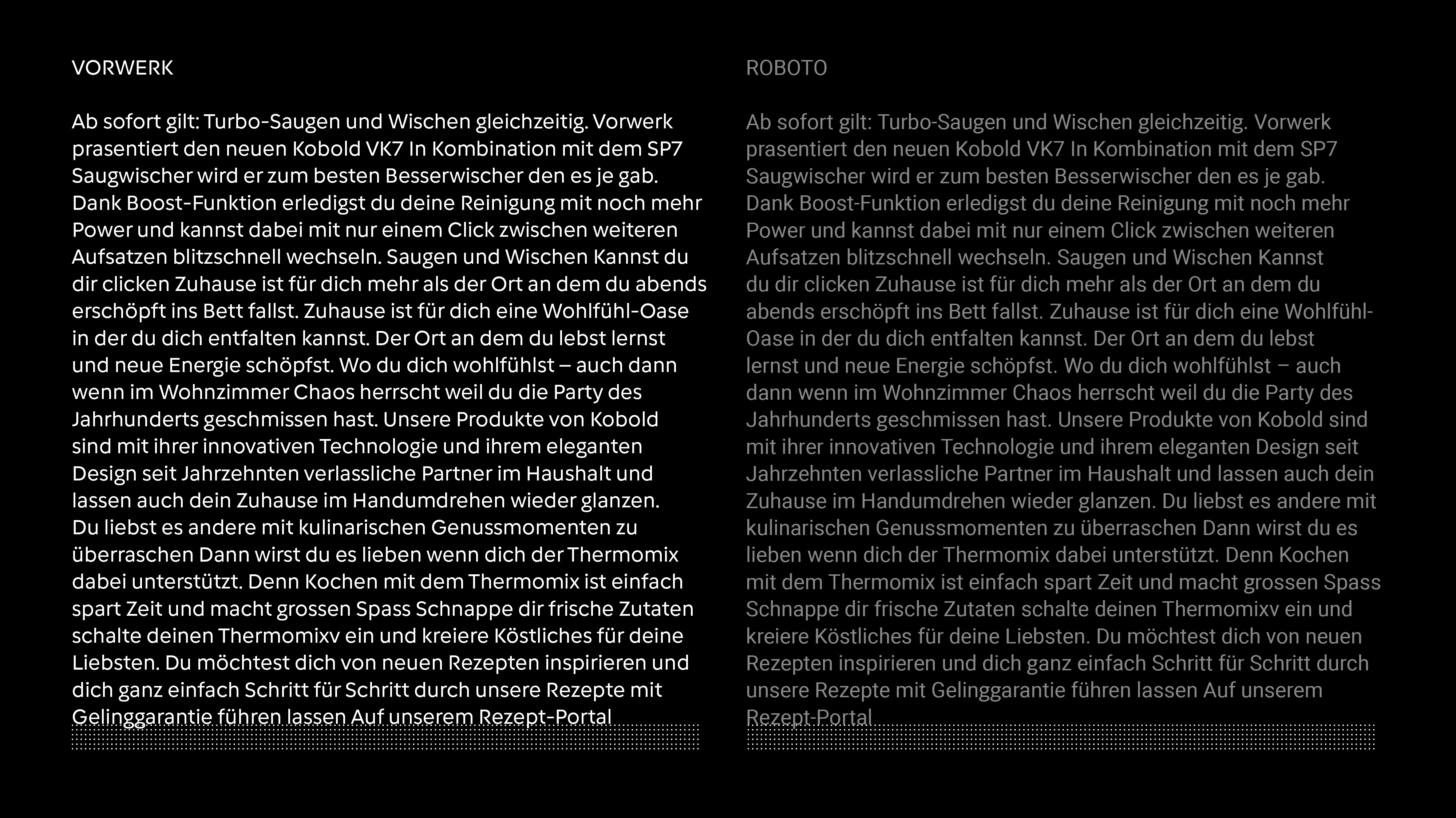
Vorwerk vs. Roboto
The aim was to design typefaces almost as space saving and text economic as Roboto. Geometric designs usually take much more room than other styles: A round geometric »o« being simply wider than a more vertical shape such as found in Roboto. Notwithstanding this »natural« disadvantage the Vorwerk typefaces take almost the same space as Roboto at the same optical size.