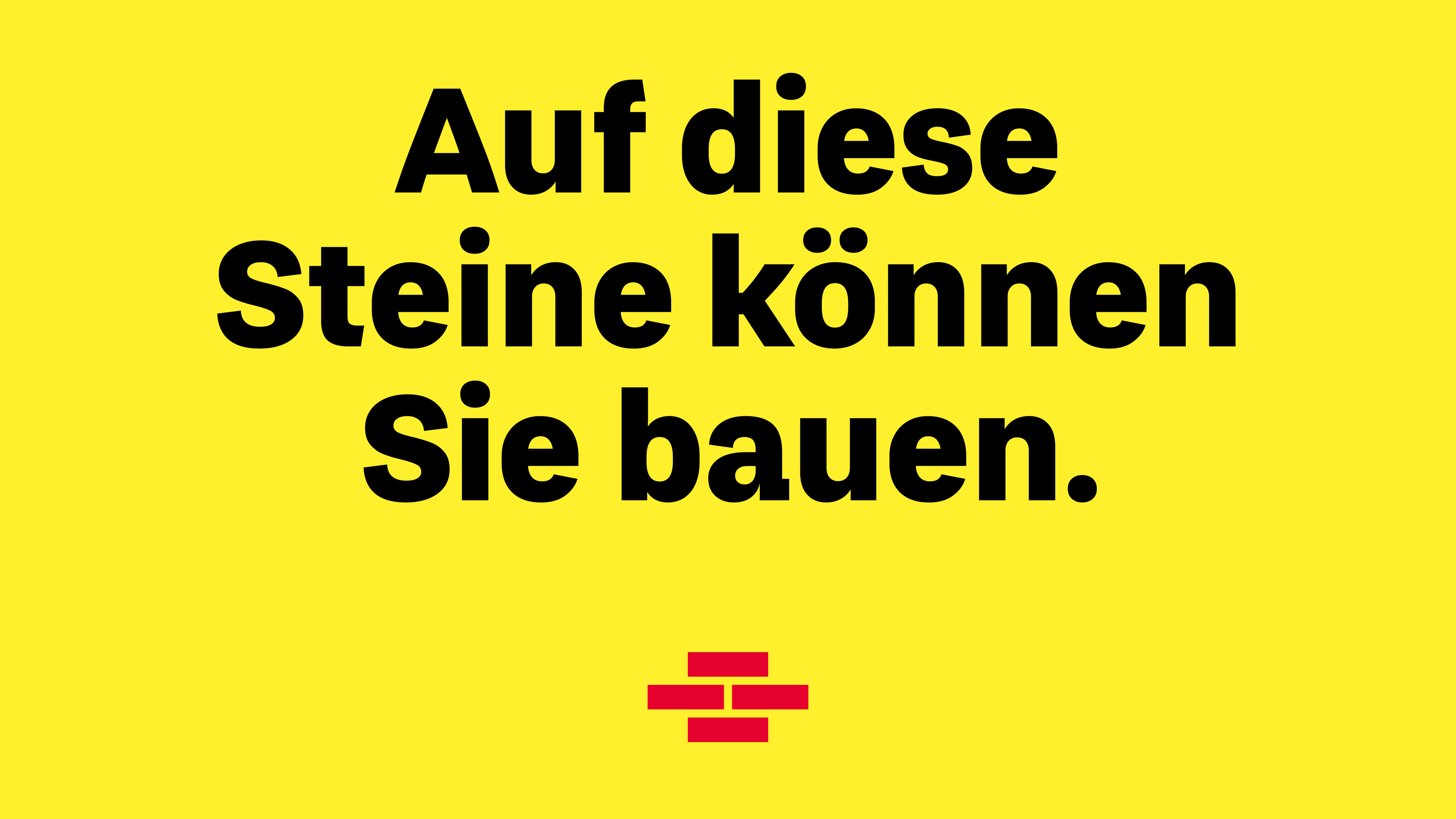

Bausparkasse Schwäbisch Hall
»Fuchs« (German for fox 🦊) is the custom typeface family for Bausparkasse Schwäbisch Hall – Germany’s largest home loan and savings bank. It is one of the largest providers of construction financing with a 90 year history, 6,500 employees and more than 10 million customers. In 2021 they got a brand redesign by Strichpunkt. Character Type partnered with them and designed the custom typefaces.
In partnership with Strichpunkt
Creative Director: Jochen Theurer
Project Design Director: Fabian Nusch
The brand and briefing
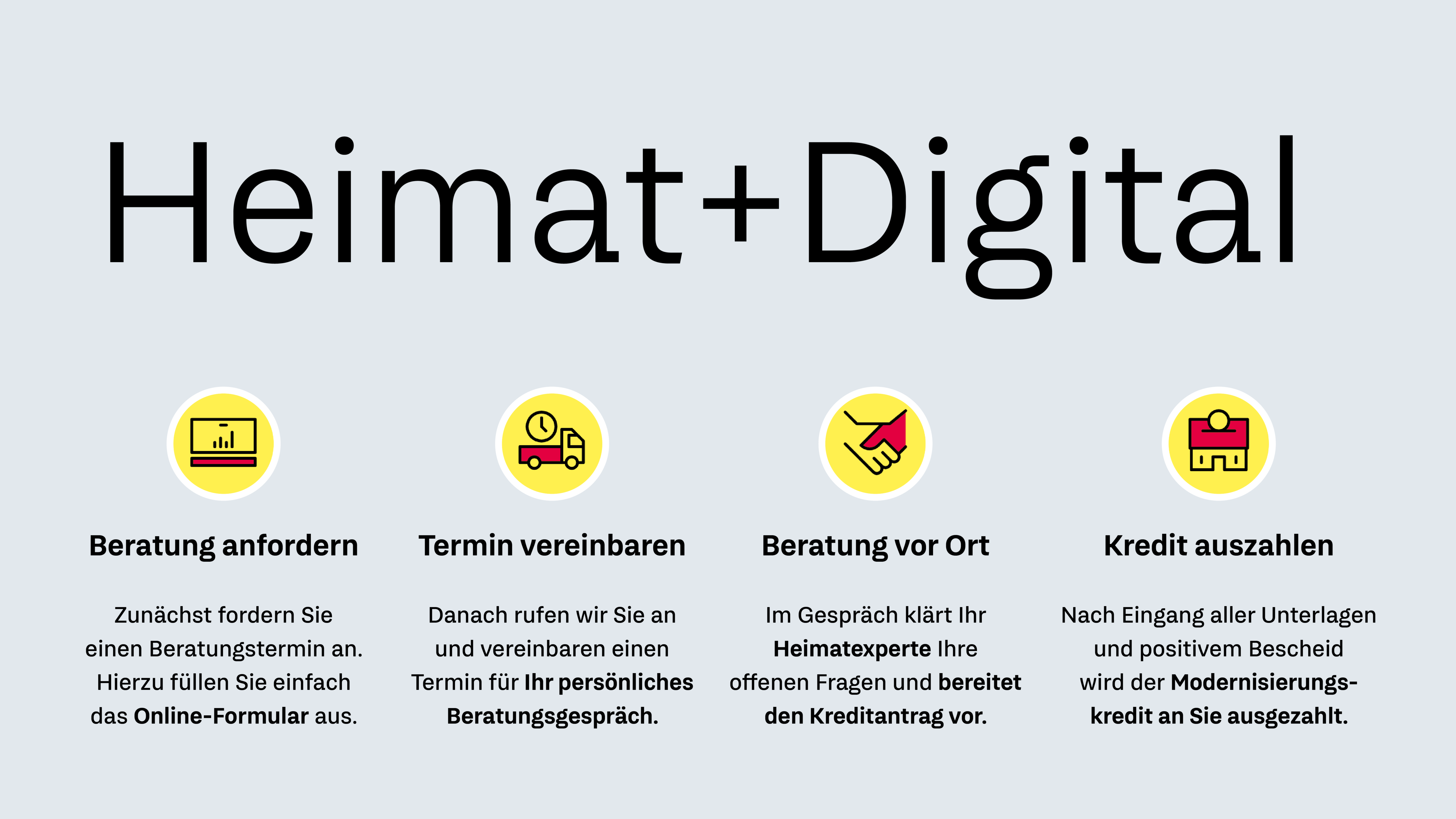
The branding of Schwäbisch Hall was centered around the strategic brand pillars »Heimat« and »Digital«. »Heimat« is more than just the German word for home. It’s a place one identifies with. A place one might have spent a childhood at. A place one might always yearn to return to. A place with lots of positive feelings attached. Add some »Digital« into this equation and you will find a modern mortgage and financing bank with an understanding of the difference between a house and »Heimat«.
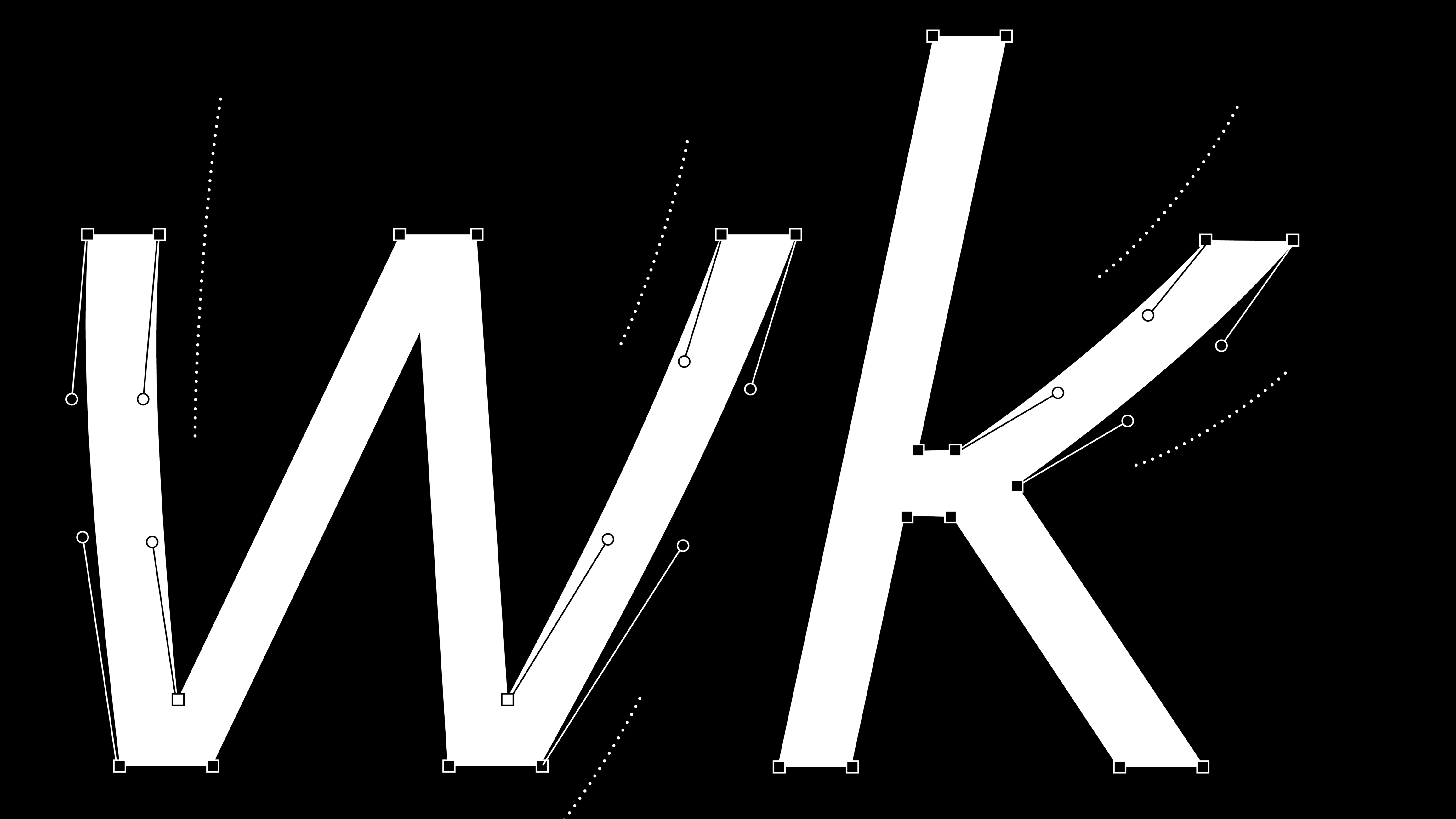
To mirror the »Heimat« aspect in the typefaces the diagonals of »Fuchs« are curved ever so slightly to add a bit of a calligraphic and thereby a human touch.

Mixed in were some »DIN« inspired straight elements adding something technical — thereby stretching the round letters. This balanced the general feel of the typeface to contain the best from both worlds.
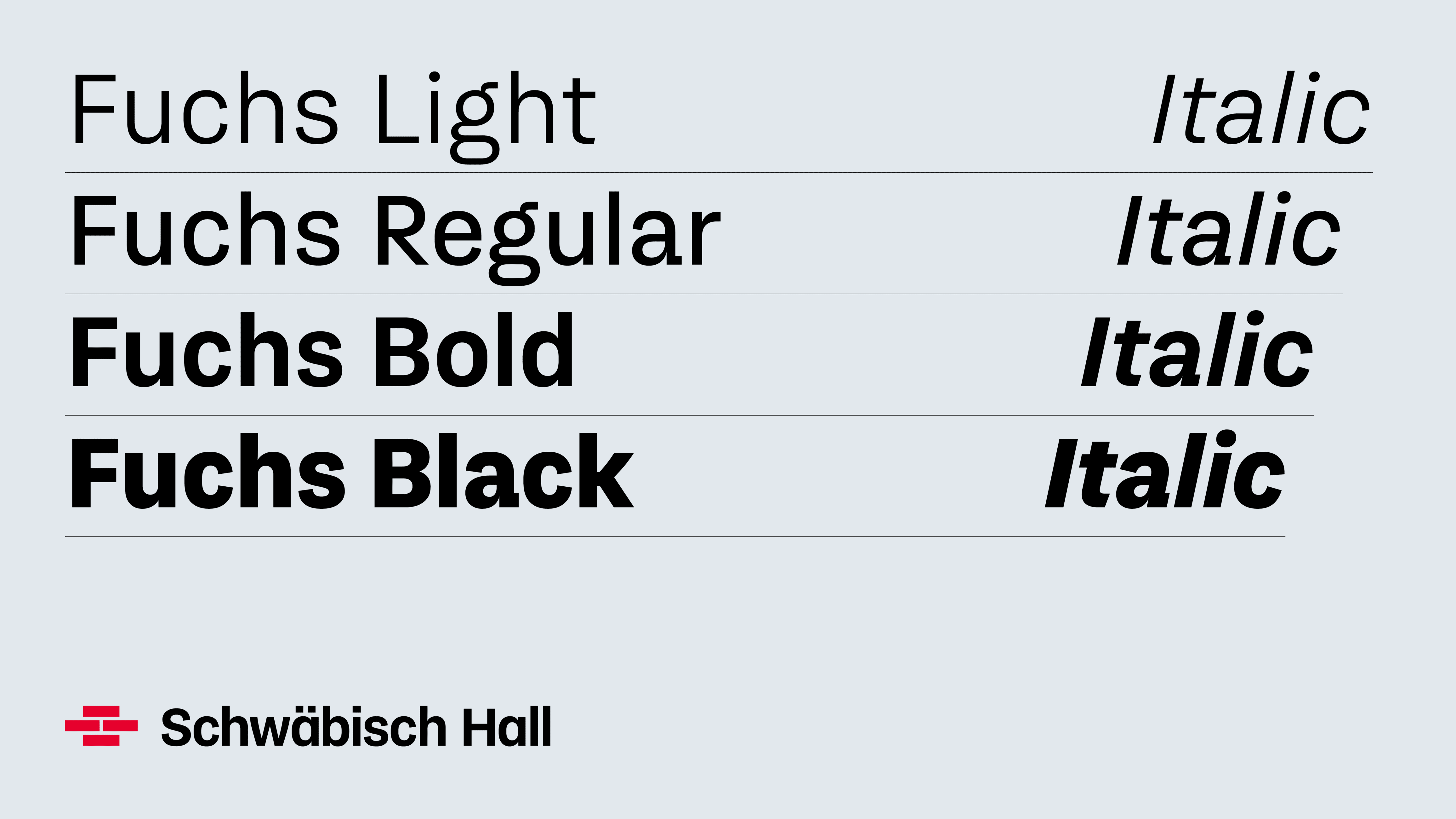
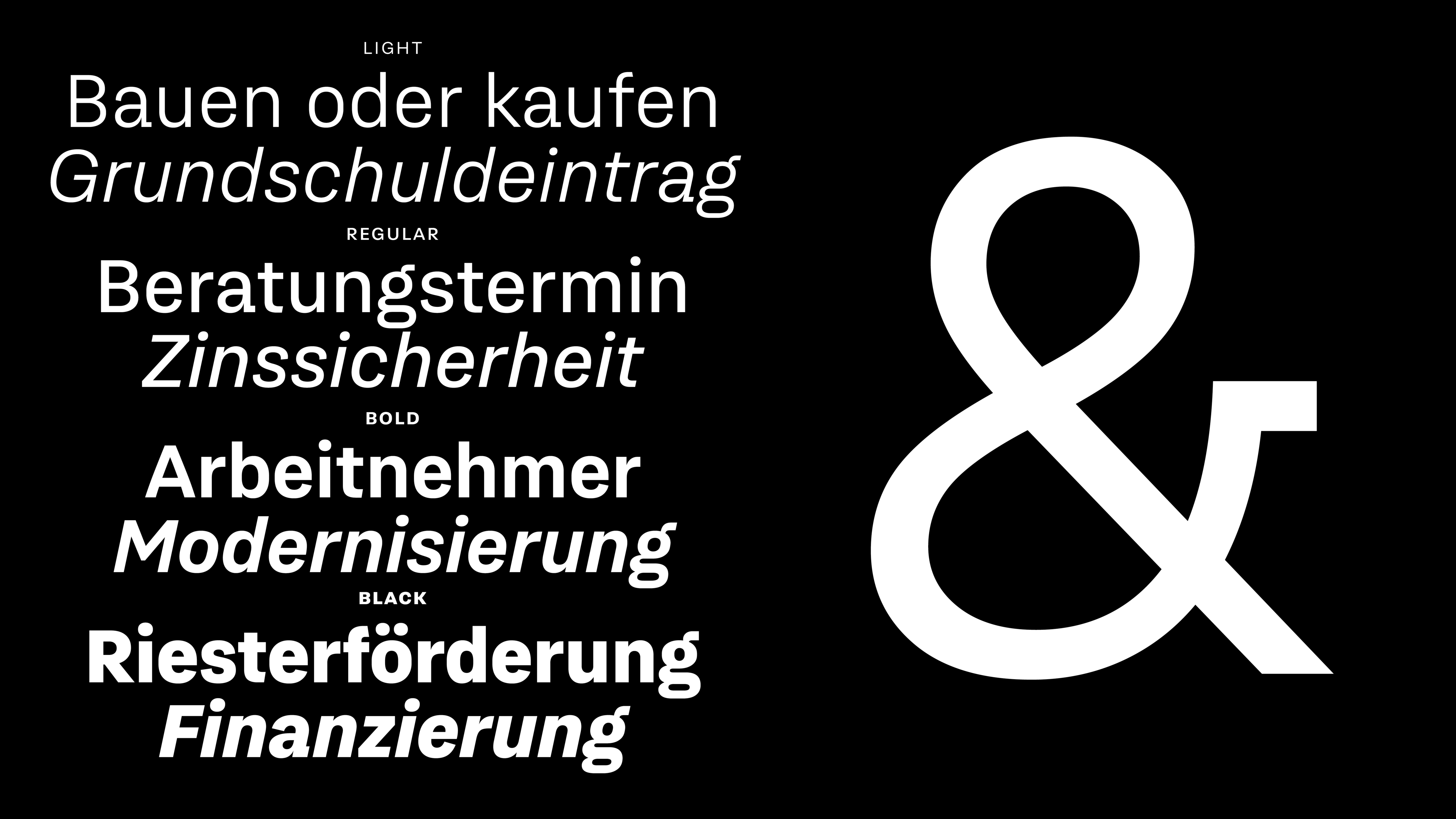
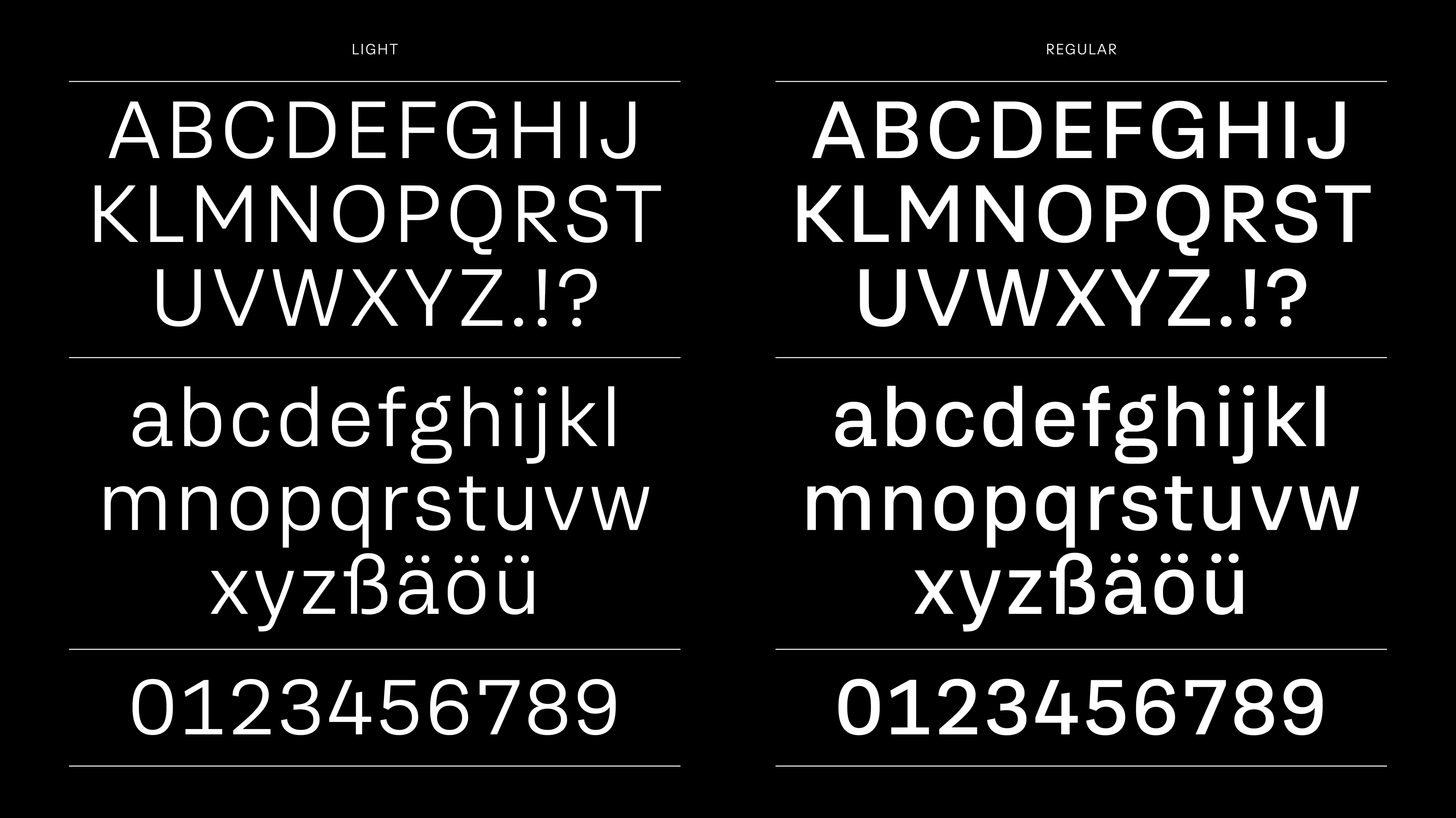
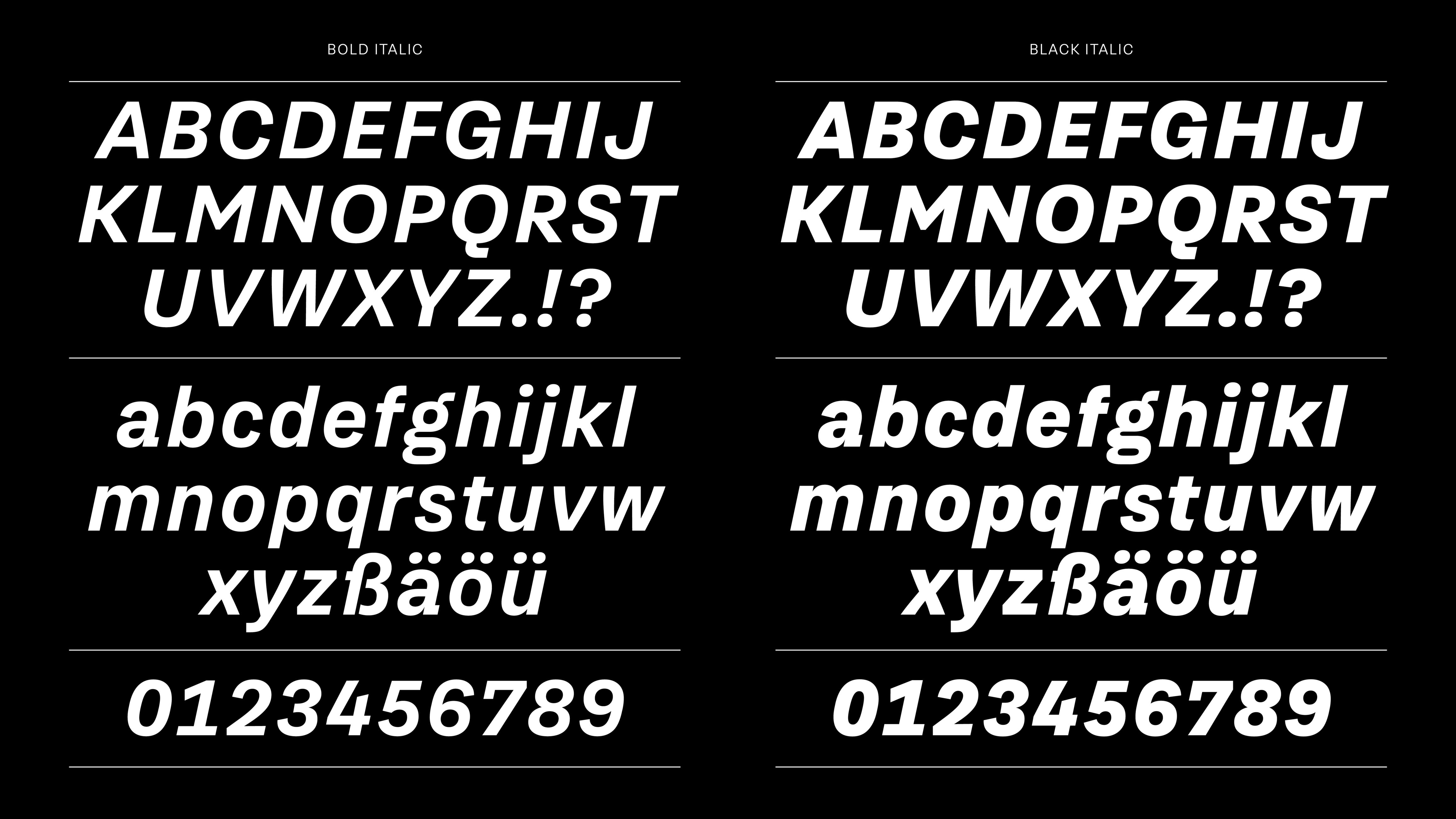
Styles


The design choices
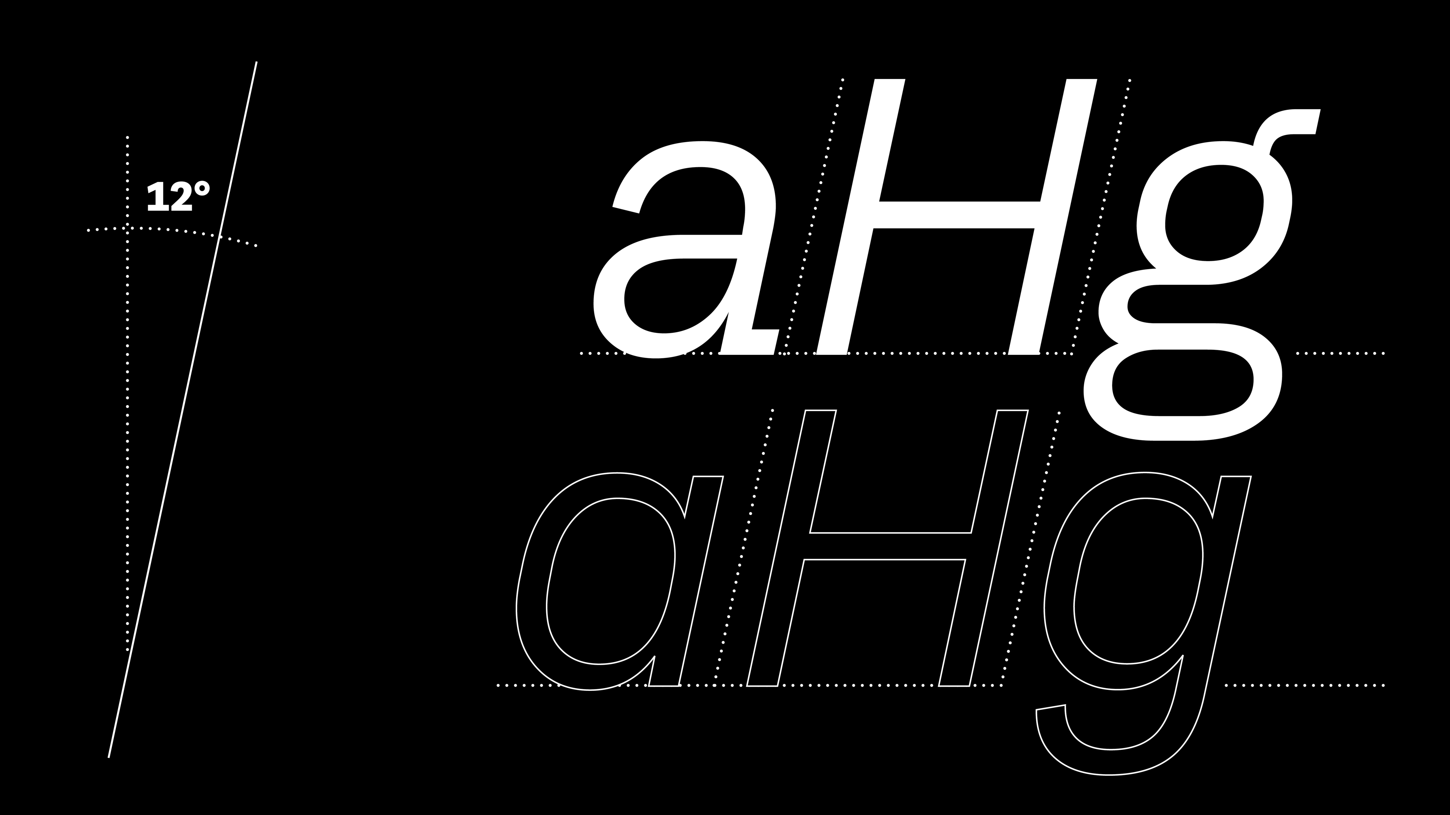
Fuchs« 🦊 has oblique (slanted) forms not italics as the standard. The italic (calligraphic) shapes are a backup option only as a reference to the word mark.

Again as a reference to the calligraphic and human touch of the typeface the endings of the above set of letters end in a straight yet angled shape.
»Fuchs« has only one set of numerals. While it’s usually a feature to have all possible kinds of figures we decided to keep it real simple. We only designed table figures (all of them take up the same width) but tweaked them for text setting. This makes it easy for anyone familiar or unfamiliar with typography to set perfect numbers.
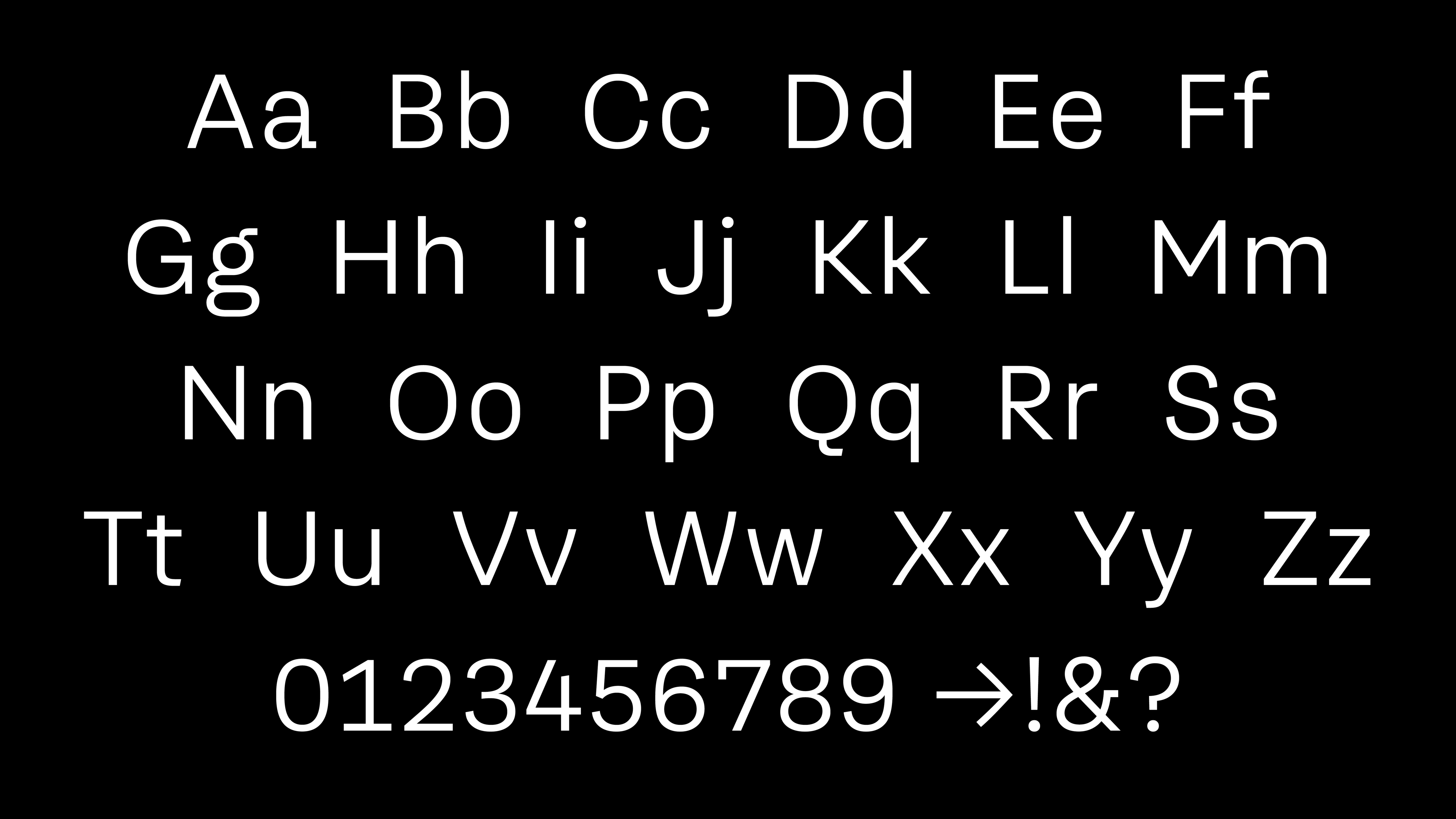
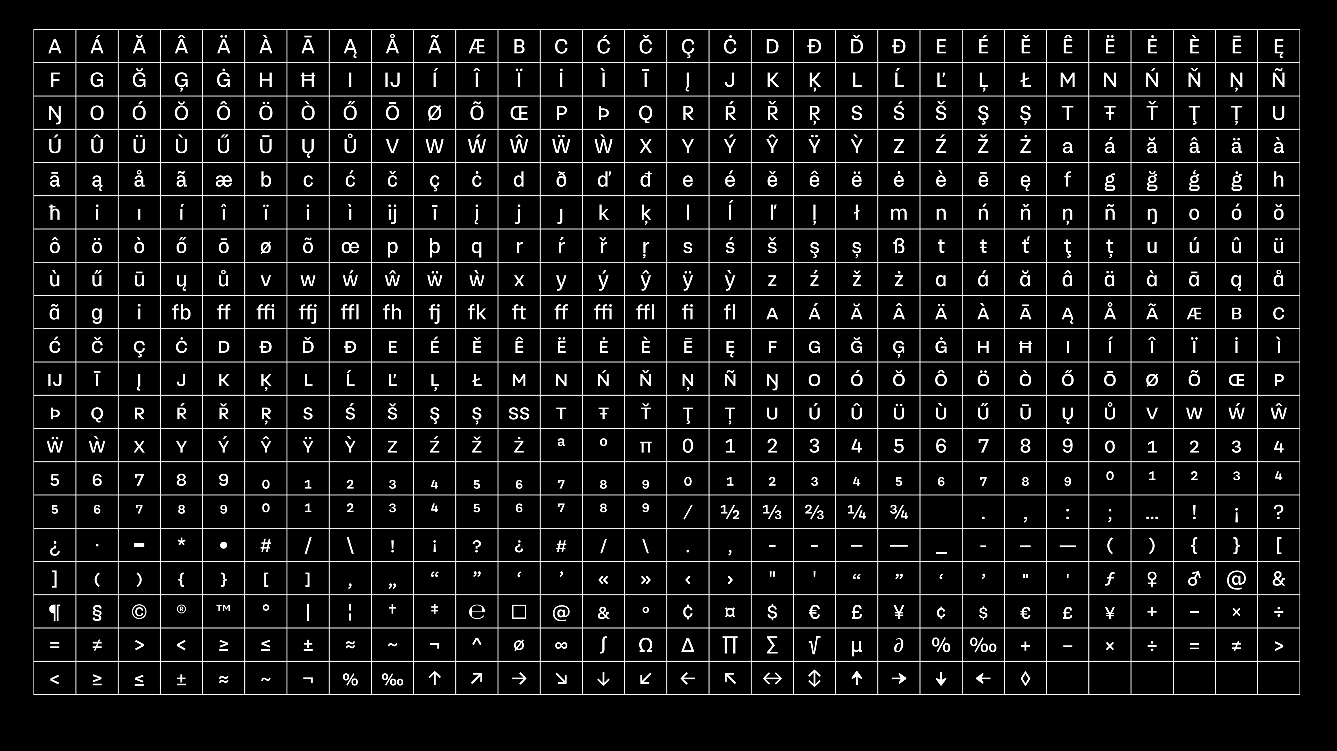
Glyph set
Each style contains about 700 glyphs. Full European diacritics, small caps, arrows, super and subscript numerals etc.
Other custom type projects
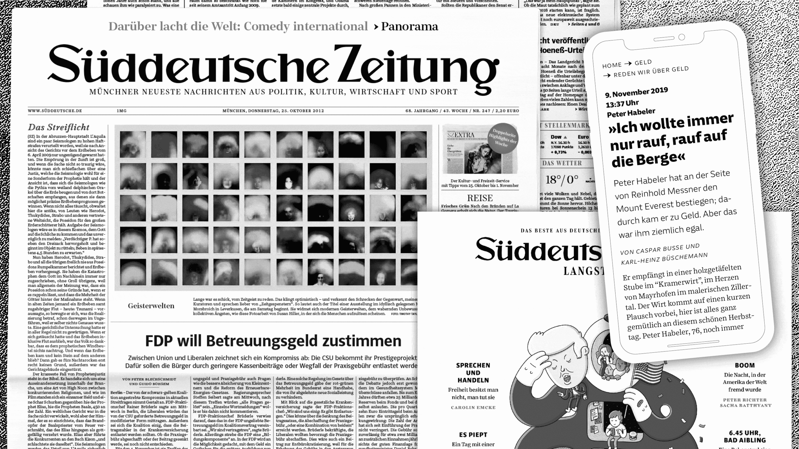
Süddeutsche Zeitung
A set of 50+ typefaces for one of Germanys largest national newspapers.
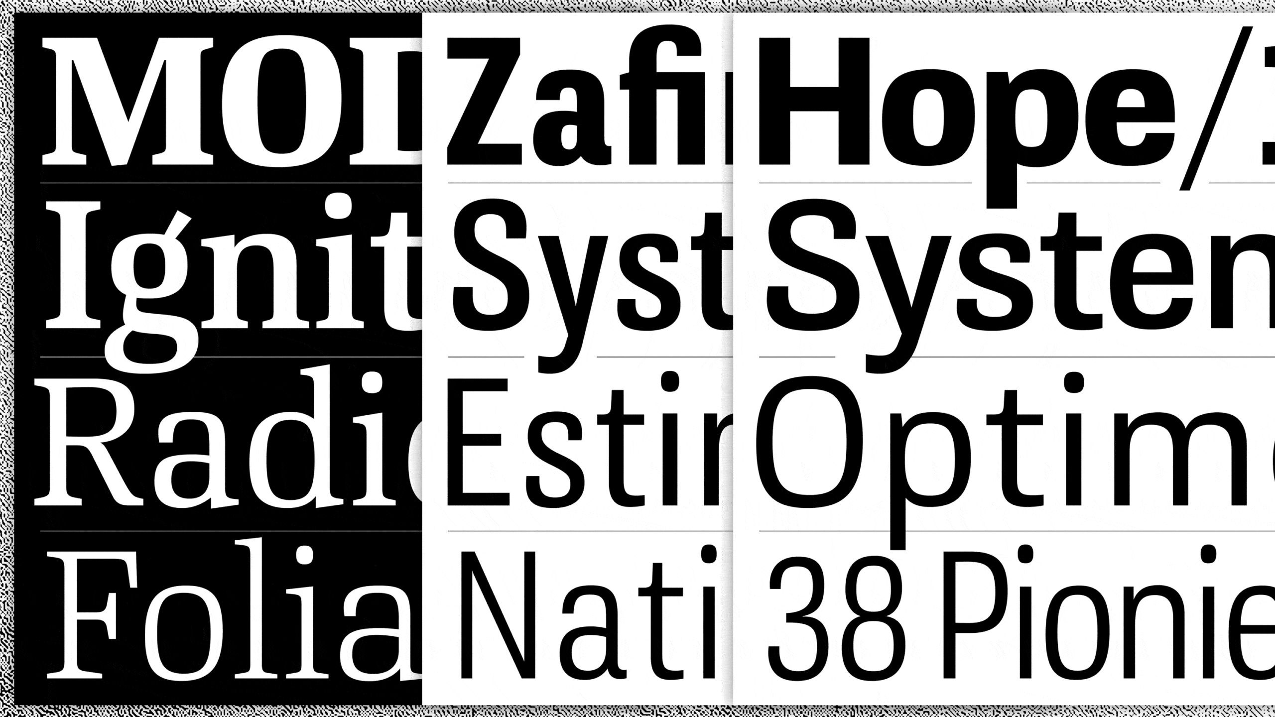
Medien Union
Typeface family ranging from serif to sans with 1.200+ glyphs per style. Lots of math and science glyphs.