OTTO Play

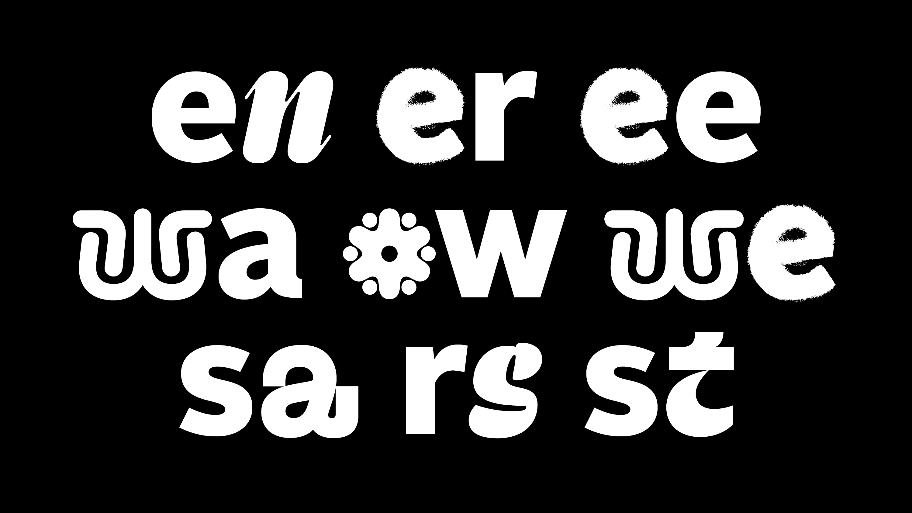
OTTO is Germanys online retail giant. As part of the OTTO brand redesign headed by brand agency Mutabor we designed the multifarious »OTTO Play« typeface. Each letter of the alphabet has a different style – but combined they form a coherent typography that is as diverse as the OTTO brand.

Designer and Type Direction: Henning Skibbe
In partnership with Mutabor
Creative Direction: Jonas Möllenbeck
Awards: 3x ADC Bronze, 2x ADC Award, Red Dot: best-of-the-best, Corporate Design Award
Image Credit: Character Type and Mutabor
Character Type – OTTO Play

Personal. Simple. Expressive. Confident.
We aimed to achieve an equal design tonality distribution across the alphabet. One out of four design tonalities were assigned to each letter in equal ratio according to the letter frequency in the German language. The frequency of letter combinations (syllables) was also taken into consideration.

Your life in four letters

OTTO’s mission is to be a lifelong companion to its customers. The »Your life in four letters« campaign stages different life phases, spelled out in four letter words, for which OTTO offers the right products: From baby’s pacifiers, to headphones for youthful beats, rings for a time of love or a mat for yoga time. OTTO is always there with the right supplies.

OTTO custom type opentype feature

»OTTO Play« is a mix of »OTTO Sans« and the new colorful alphabet created for this project. To establish a balanced mix of these two an OpenType script was written. Depending on the letter combination a »OTTO Sans« glyph is substituted by one from the »OTTO Play« alphabet. This makes it really easy to use the font: The mixing of letters is fully automated.

OTTO custom type opentype feature

Depending on which letters follows another, one of the two is automatically exchanged. This is made possible by OpenType rules that refer to the letter frequency of letters in German.

The analysis of the letter frequency and the appropriate distribution of the letters across the design tonalities led to the font »OTTO Play« representing the entire diversity of the OTTO brand. The syllable frequency in German was included as an extended parameter and ensures maximum variety in the letter mix.

Other custom type projects

Character Type – OTTO Play

Süddeutsche Zeitung
A set of 50+ typefaces for one of Germanys largest national newspapers.

Character Type – OTTO Play

Medien Union
Typeface family ranging from serif to sans with 1.200+ glyphs per style. Lots of math and science glyphs.