EatHappy
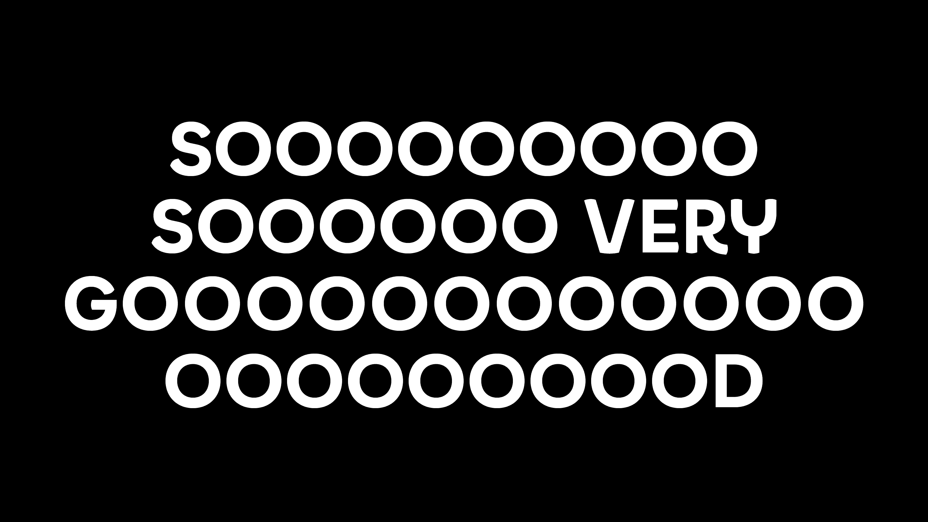
In 1,000+ locations within super markets across Europe EatHappy offers lovingly handmade sushi and many other Asian specialities. In 2021 we created the happy headline typeface family as part of the brand redesign by Korefe.
In partnership with Korefe
Creative Director: Alan von Lützau
The brand and briefing
Eat Happy is a friendly brand by name. The 2021 rebranding made it a mission to make this friendliness visible in every brand asset. Imagery, colors, copy and type. The idea of the smiling type was born by Alan von Lützau and his team at Korefe. They approached us with basic sketches and asked us to turn it into a typeface.
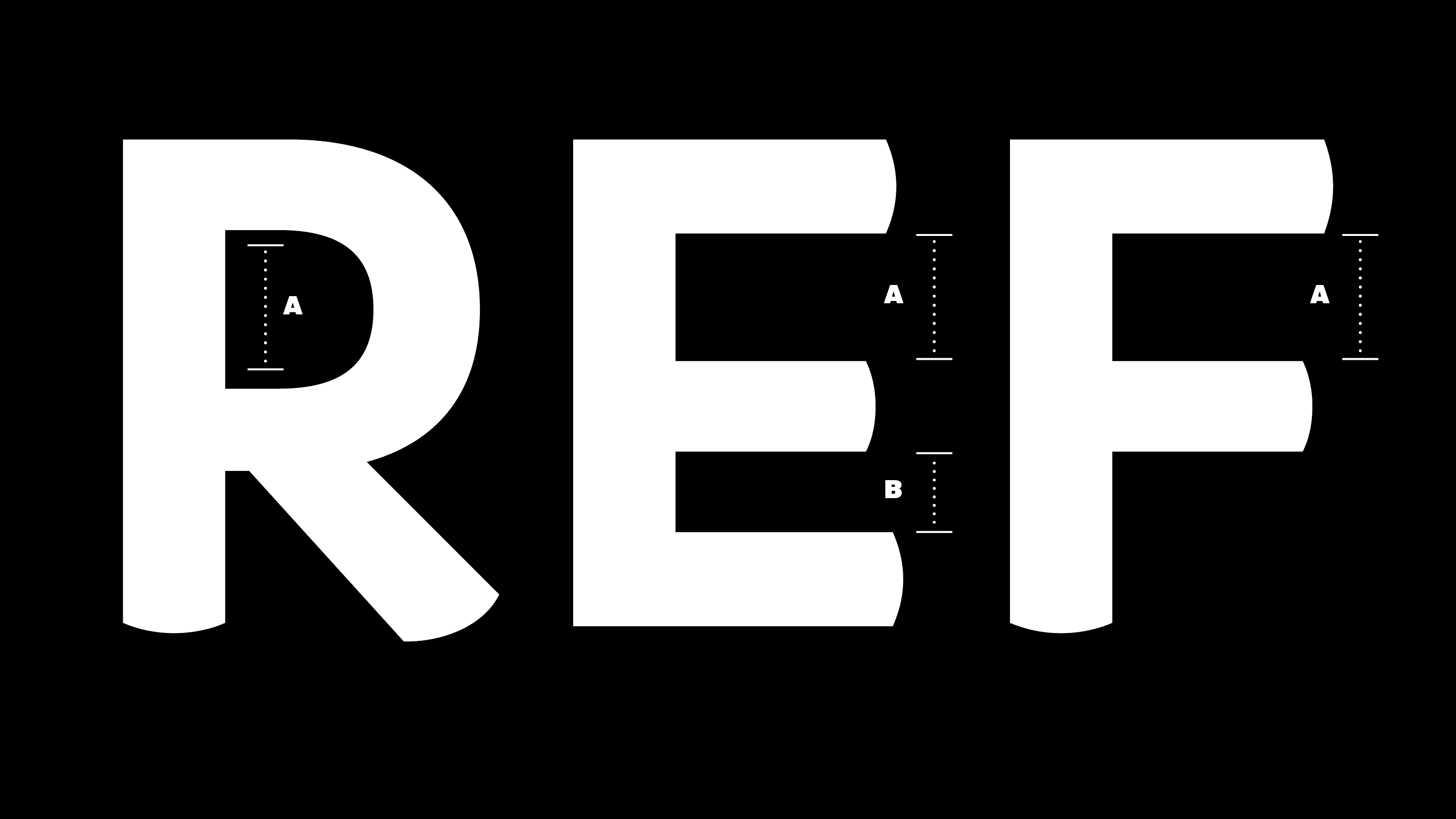
For a few glyphs some more eccentric shapes were added.
These may be accessed through the lower case letters in the PRO version of the EatHappy fonts.
Glyph set
Maybe one of the smallest glyph sets we ever produced. But hey, we had to keep a lean budget. And since its a uppercase headline typeface, no one needs all the craze.
Other custom type projects
Süddeutsche Zeitung
A set of 50+ typefaces for one of Germanys largest national newspapers.
Schwäbisch Hall
A sans serif family for Germanys largest home financing bank.

