Lamborghini
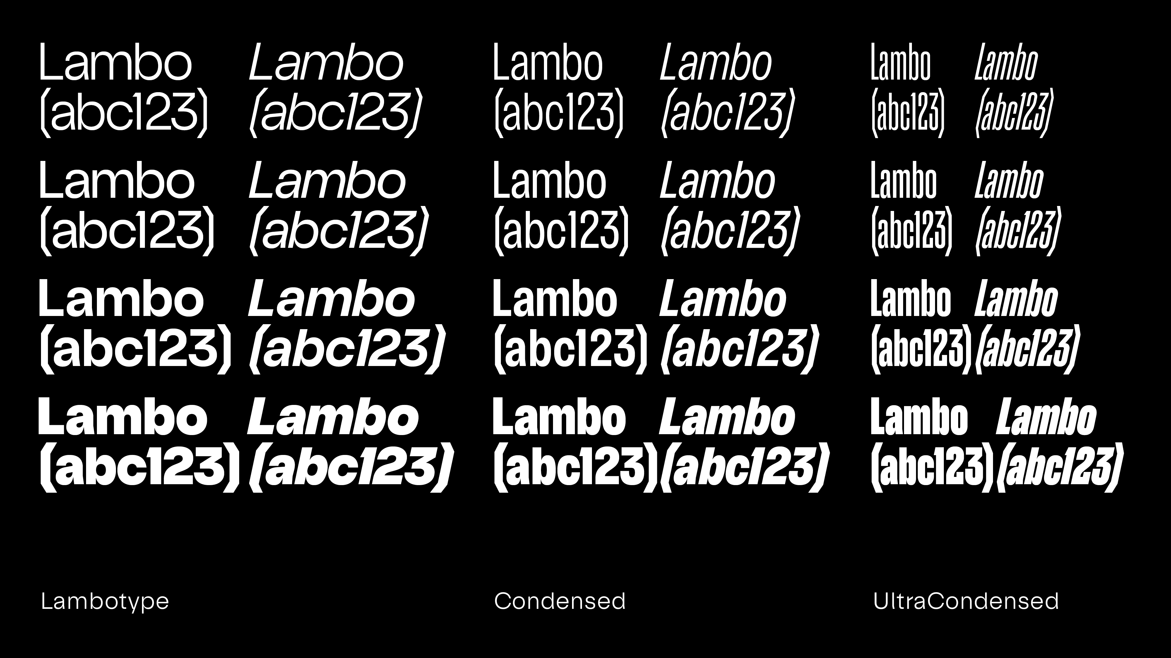
Inspired by Lamborghini’s rich heritage and the “Direzione Cor Tauri – Another step forward” transformation process, the Lambotype typefaces embody the extraordinary and the unconventional. Designed by Character Type as part of the Lamborghini brand redesign led by Strichpunkt, this extensive typeface family, ranges from Normal to Ultracompressed and Light to Black. The typeface Lambotype, just as the brand in general, spotlights the extraordinary, the unconventional, breaking the general rules.
Latin Extended, Cyrillic, Greek
205 languages supported
Design: Oleksandr Parkhomovskyy, Philipp Neumeyer, Jakob Fangmeier; Font Production: Sebastian Carewe
Design Director: Nicola Wetzel
Senior Art Director: Marcel Ziegler
Image Credit: Character Type, Lamborghini, Strichpunkt
Photography: Philipp Rupprecht

Design Language

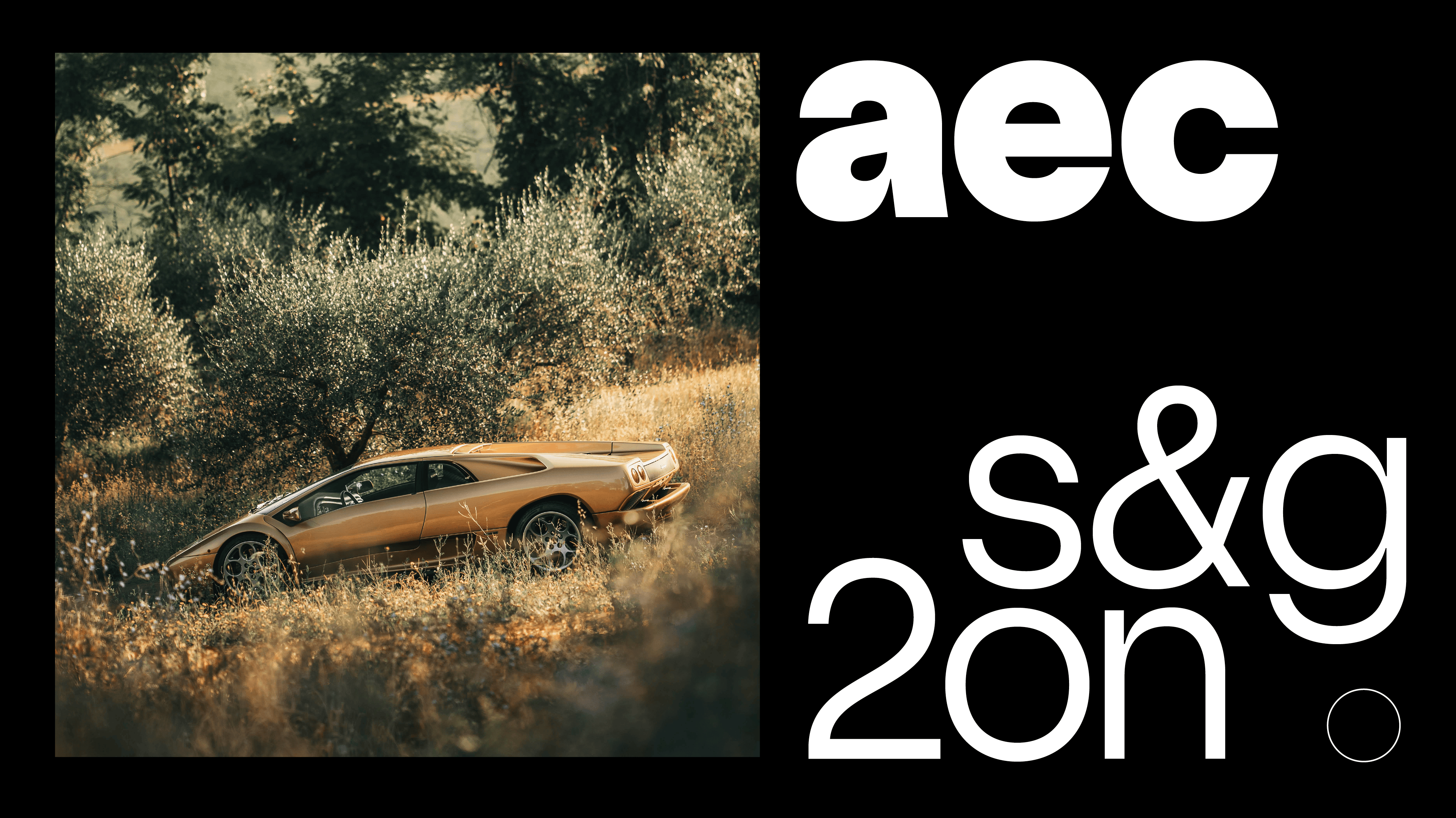
Authentic, Brave, Unexpected Lambotype’s Neo-Grotesk style seamlessly blends Lamborghini’s design DNA with a human touch. Each letter is meticulously crafted, with geometric base shapes such as hexagons, three-armed stars, and circles as a reference.
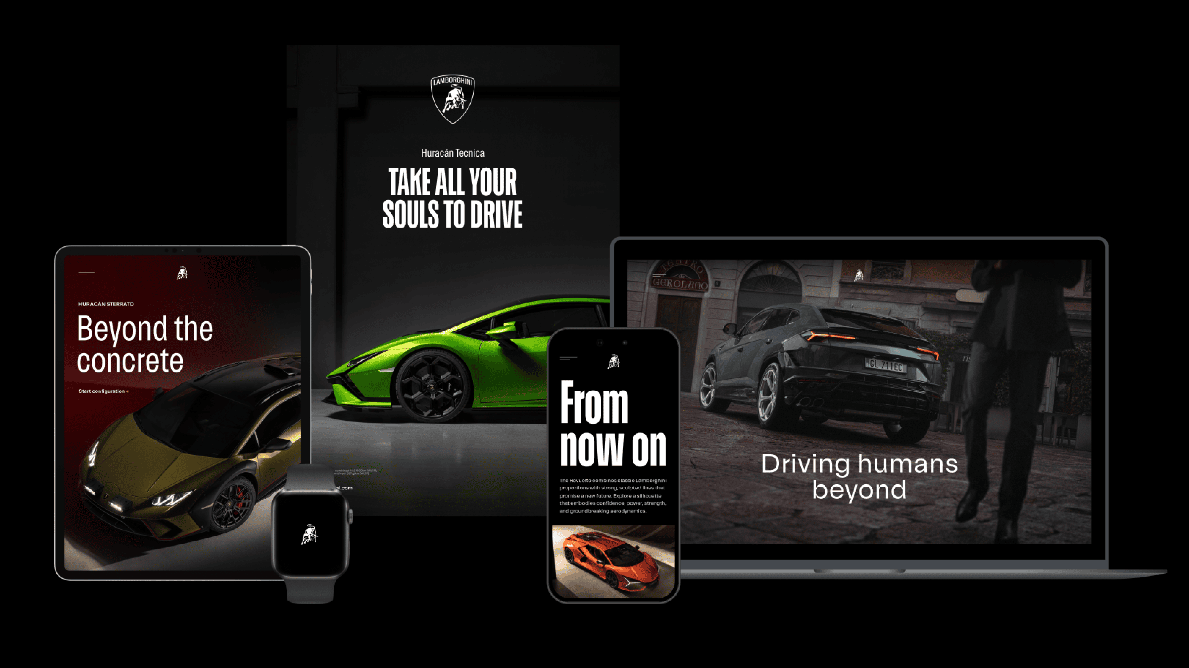
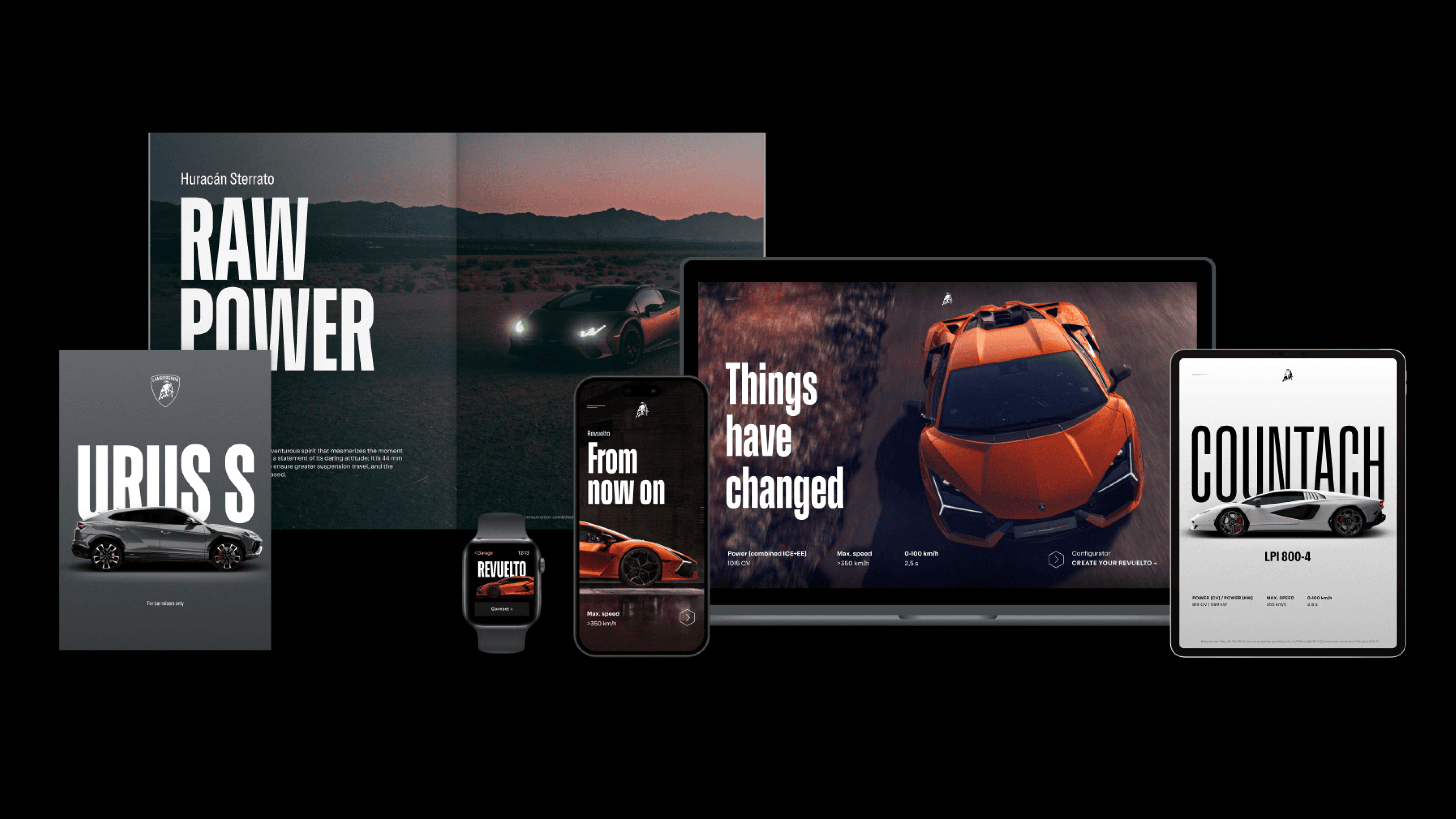
In Use
Design Elements

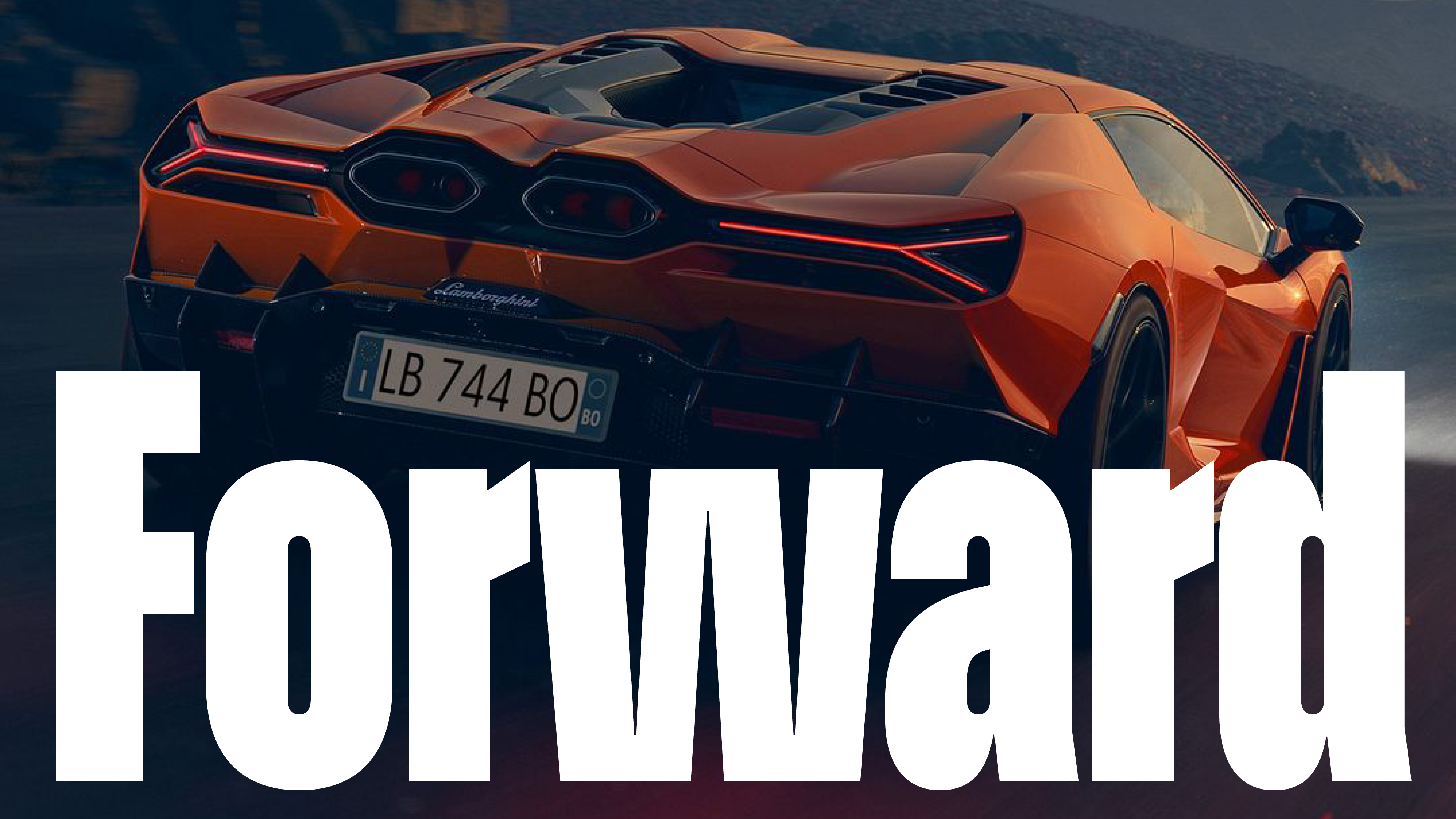
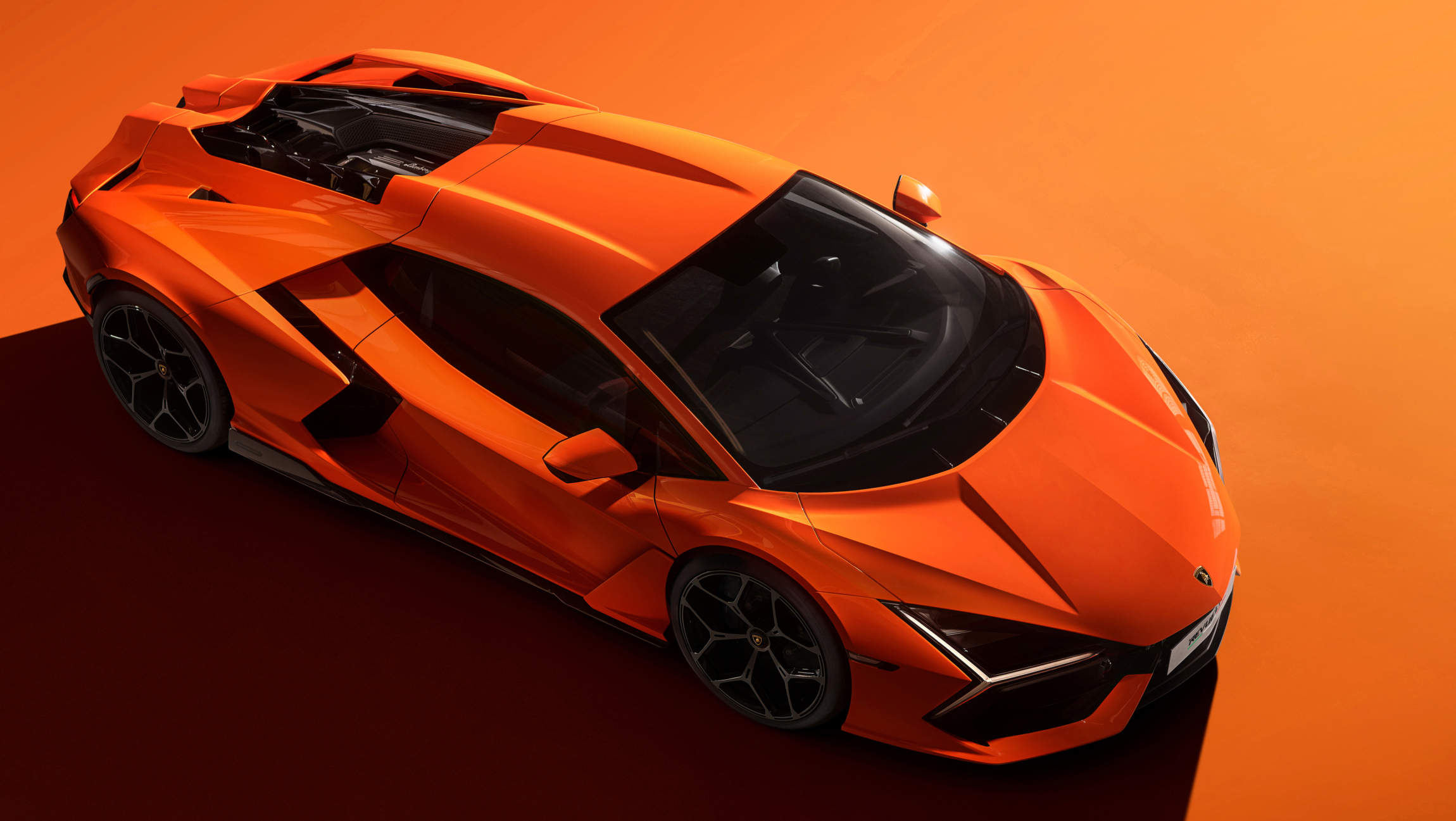
The distinctive 12° angled terminals of certain letters are a nod to the aerodynamic lines of Lamborghini’s super sports cars, setting Lambotype apart as an unconventional exception in the typographic landscape.

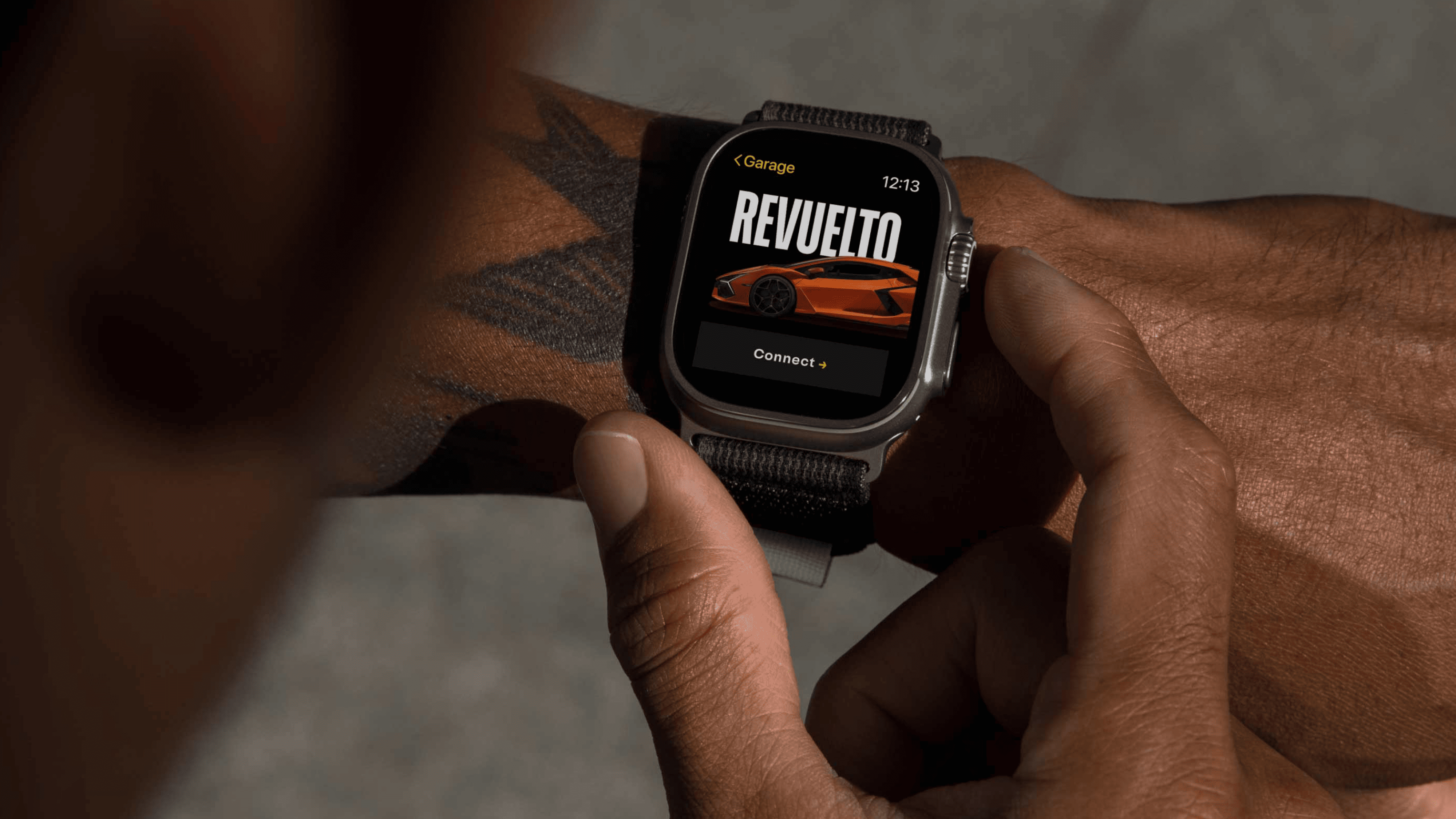
Support for 200+ languages and coverage of scripts including Latin, Cyrillic, and Greek, Lambotype enables Lamborghinis content to be accessed widely. It caters to Lamborghini’s global audience, reinforcing the brand’s commitment to connecting with enthusiasts worldwide. The design space for the accents is tightly organized and clearly allocated within the bounds of ascenders and descenders. Headlines or copy, one-liners or paragraphs: All keep a calm and laid-back feel.

Letters such as K, M, t and many more are quoting the edgy and sharp Lamborghini design elements.

The deep inktraps infuse a human touch as well as dynamics into the design.
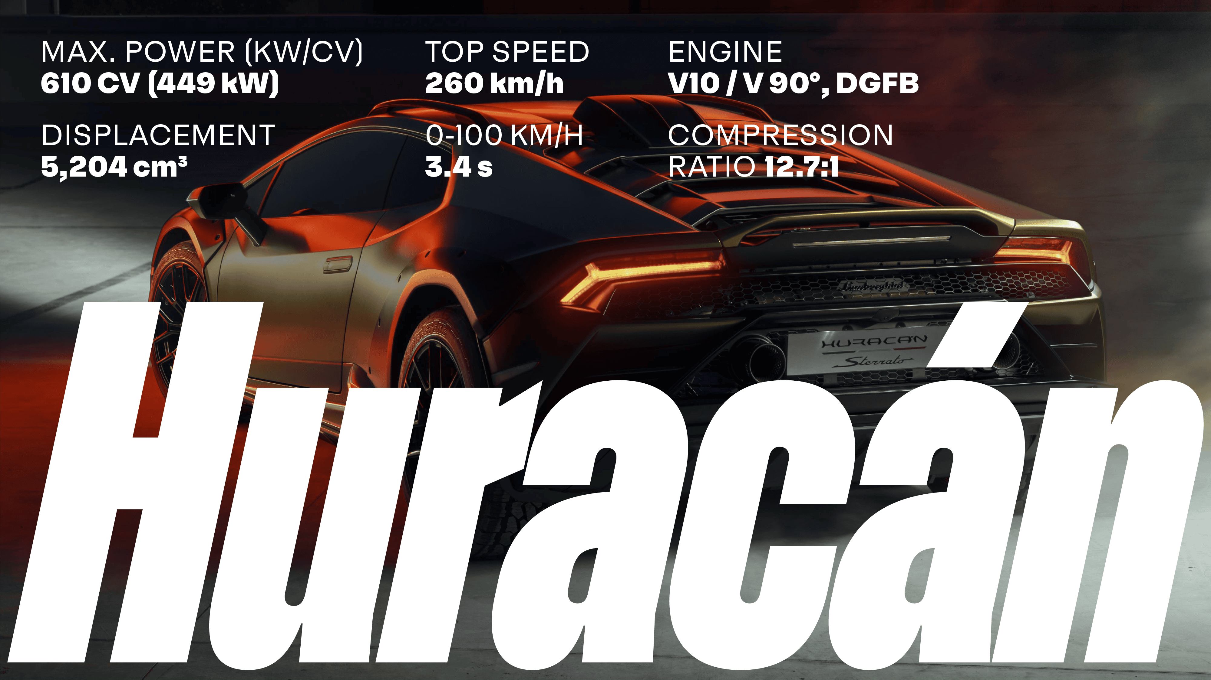
Lambotype widths stretch from Normal to Condensed to Ultracondensed.
In Use