Lapidar (Version 0.3)
Lapidar is a slightly fickle sans serif inspired by late 19th century metal type. It was first introduced in 1874/75 as an uppercase only typeface by Genzsch & Heyse from Hamburg/Germany, unfortunately without naming any of the designers. Around 1895 a set of lowercase letters was introduced. Even a very narrow design (under the same name but with very different design features) was marketed. Surprisingly all these styles had only one weight: the same Semilight/Regular weight.
While intending to keep the historic feel of the typeface it was apparent that some of the stranger idiosyncrasies of the historic model had to be ironed out: The very narrow »A« or »M« were widened to make them fit into the uppercase system more organically. Other elements such as the varying angles of the terminals (a, c, e, s, r…) were kept as inconsistent as in the original. The original design is also quite inconsistent across type sizes making it a challenge to decide which form to use in the revival. The introduction of a heavy weight is challenge in itself since it was a search for a bold design true to the existing lighter weight without a historic model.
Try Lapidar Here:
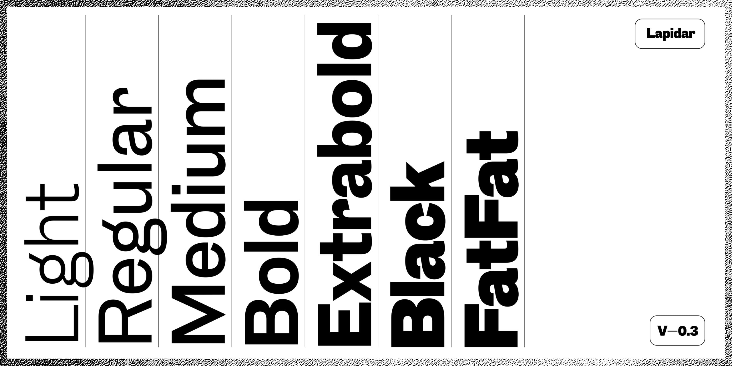
Lapidar Light
Lapidar Regular
Lapidar Medium
Lapidar Bold
Lapidar Extrabold
Lapidar Black
Lapidar FatFat
The design ideas

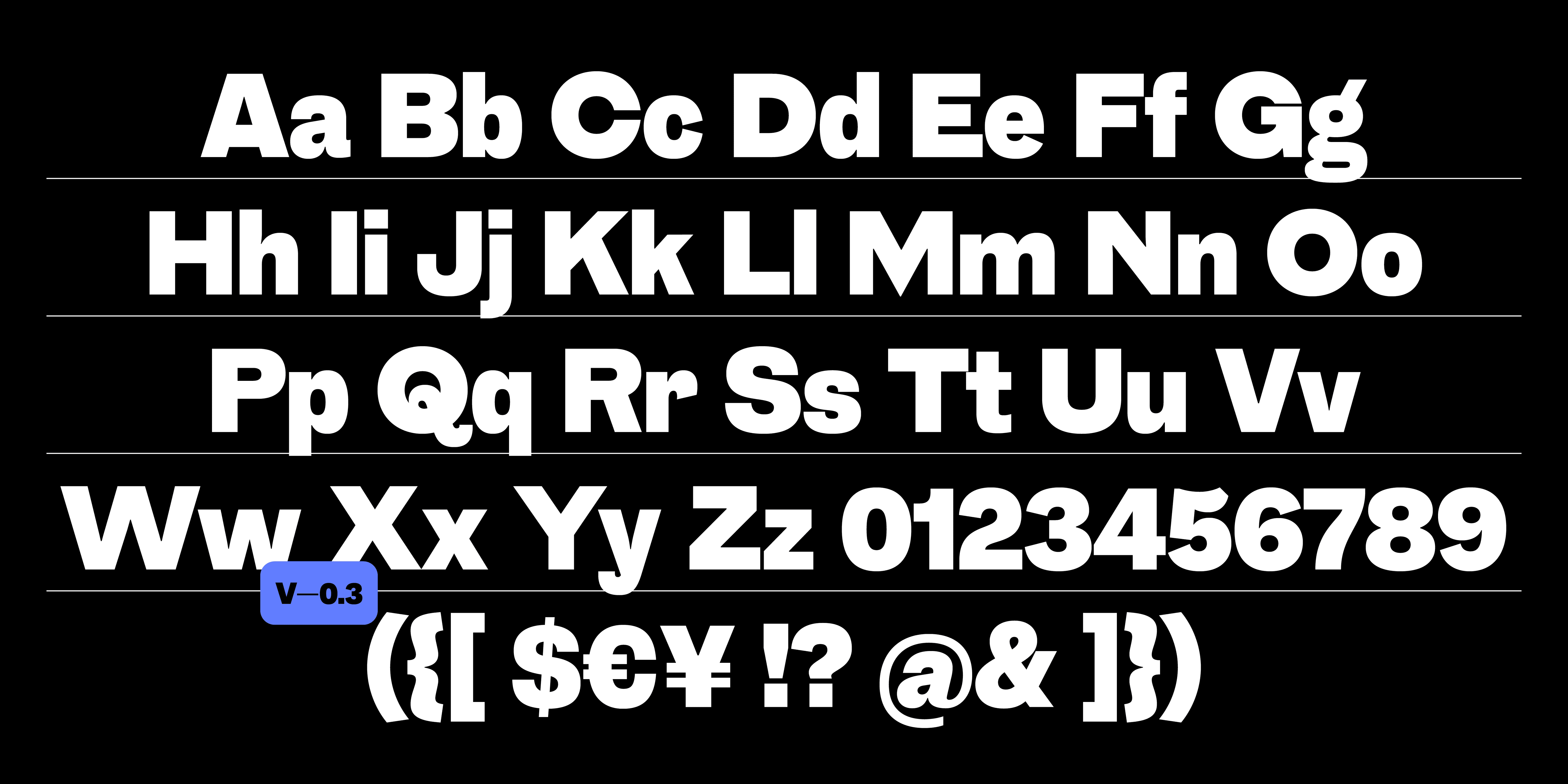
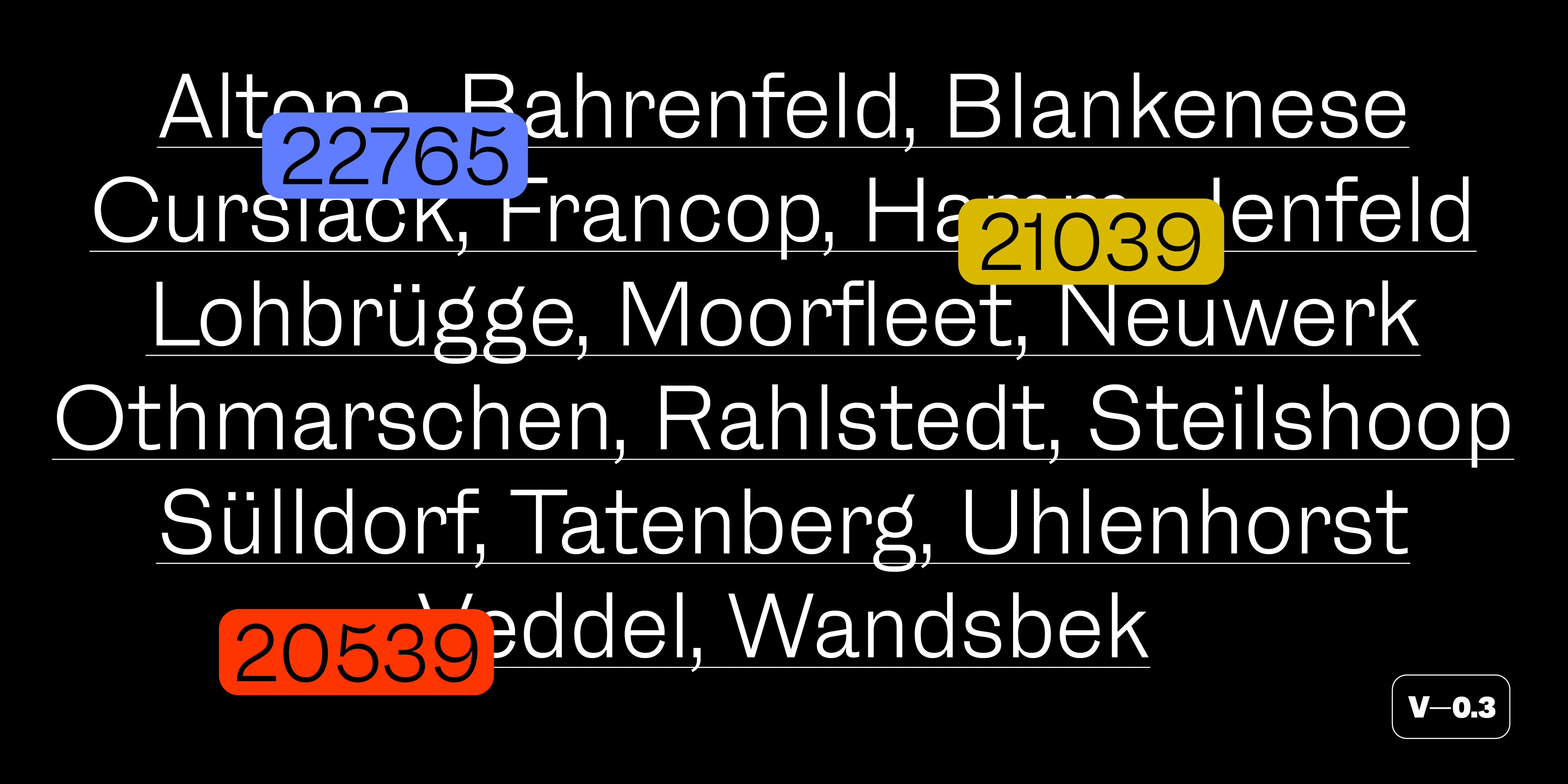
At this stage (V0.3, June 2024) Lapidar has a an extended character set. You can write in many Latin based languages such as English, Spanish, French, Portuguese or German and many more. Now the typeface family also has seven styles from Light to Black. Italics will be added soon. Maybe a condensed set of fonts will be produced as well.
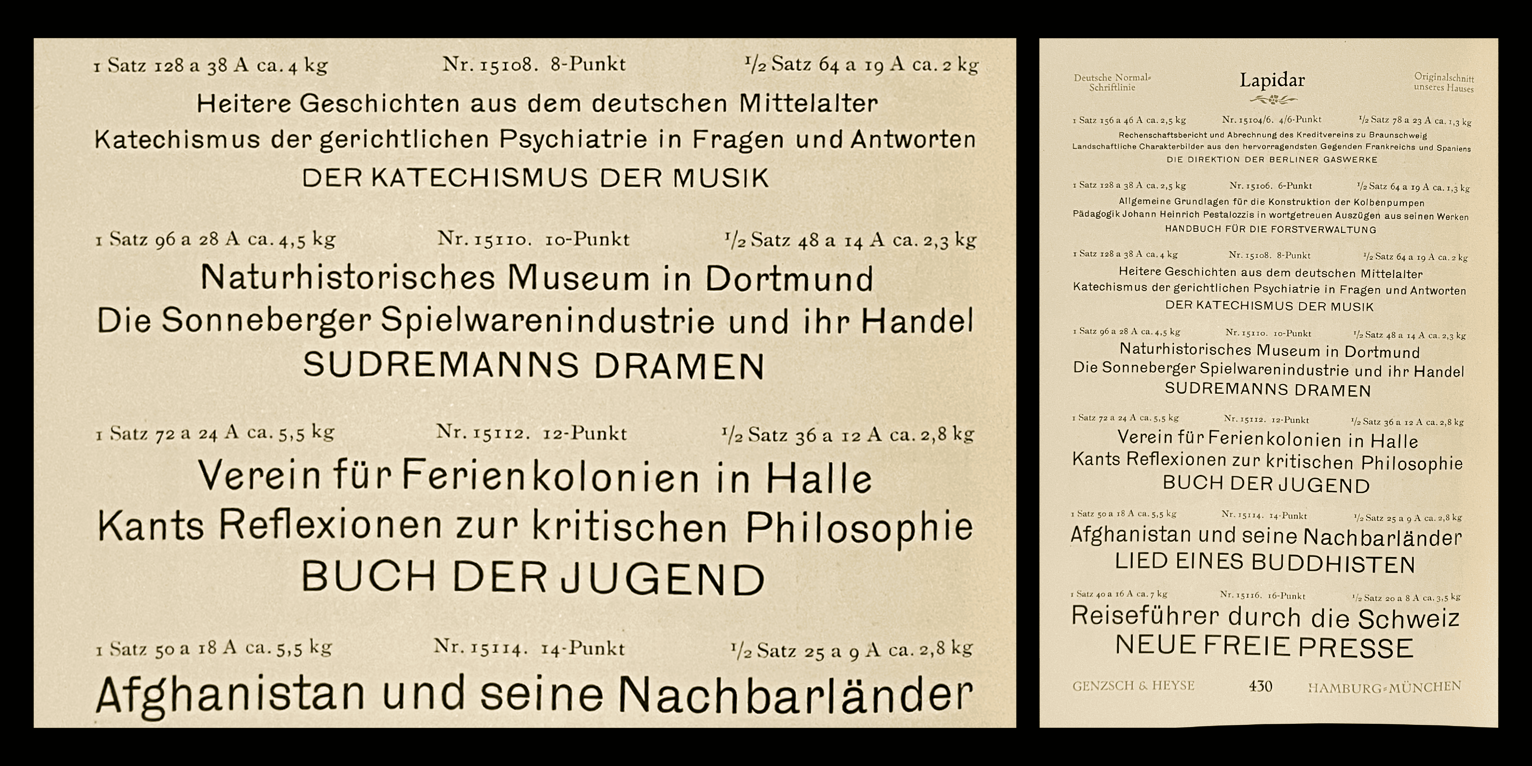
Lapidar was first introduced in 1874/75 as an uppercase only typeface by Genzsch & Heyse from Hamburg/Germany, unfortunately without naming any of the original designers. Around 1895 a set of lowercase letters was introduced. Even a very narrow design (under the same name but with very different design features) was marketed. Surprisingly all these styles had only one weight: the same Semilight/Regular weight. Thanks to Dan Reynolds for the research help!
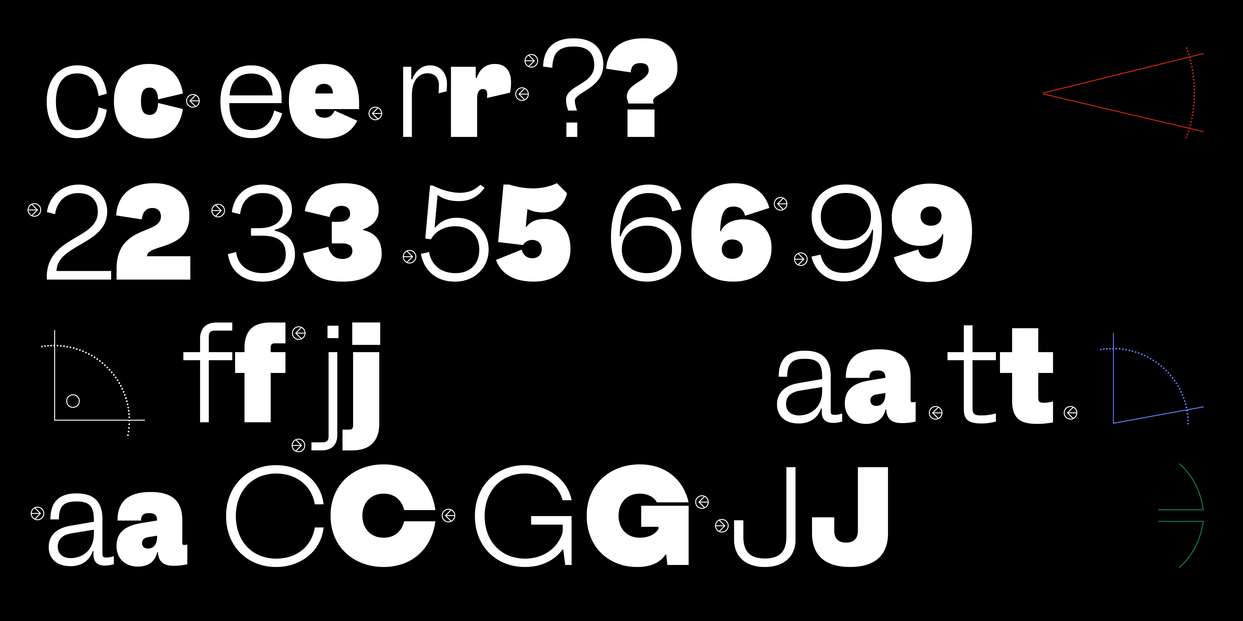
While intending to keep the historic feel of the typeface it was apparent that some of the stranger idiosyncrasies of the historic model had to be ironed out: The very narrow »A« or »M« were widened to make them fit into the uppercase system more organically. Other elements such as the varying angles of the terminals (a, c, e, s, r…) were kept as inconsistent as in the original. The original design is also quite inconsistent across type sizes making it a challenge to decide which form to use in the revival.
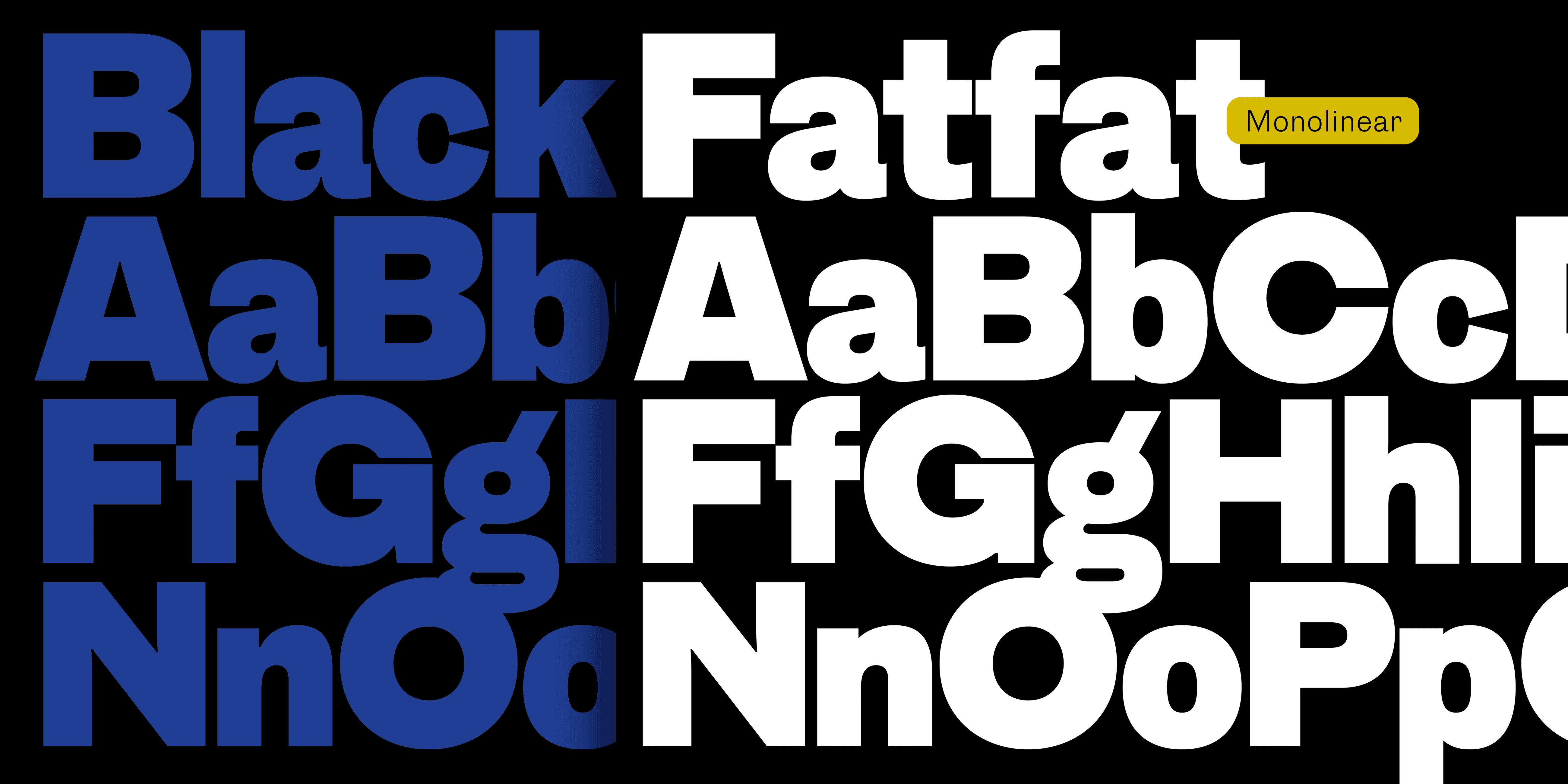
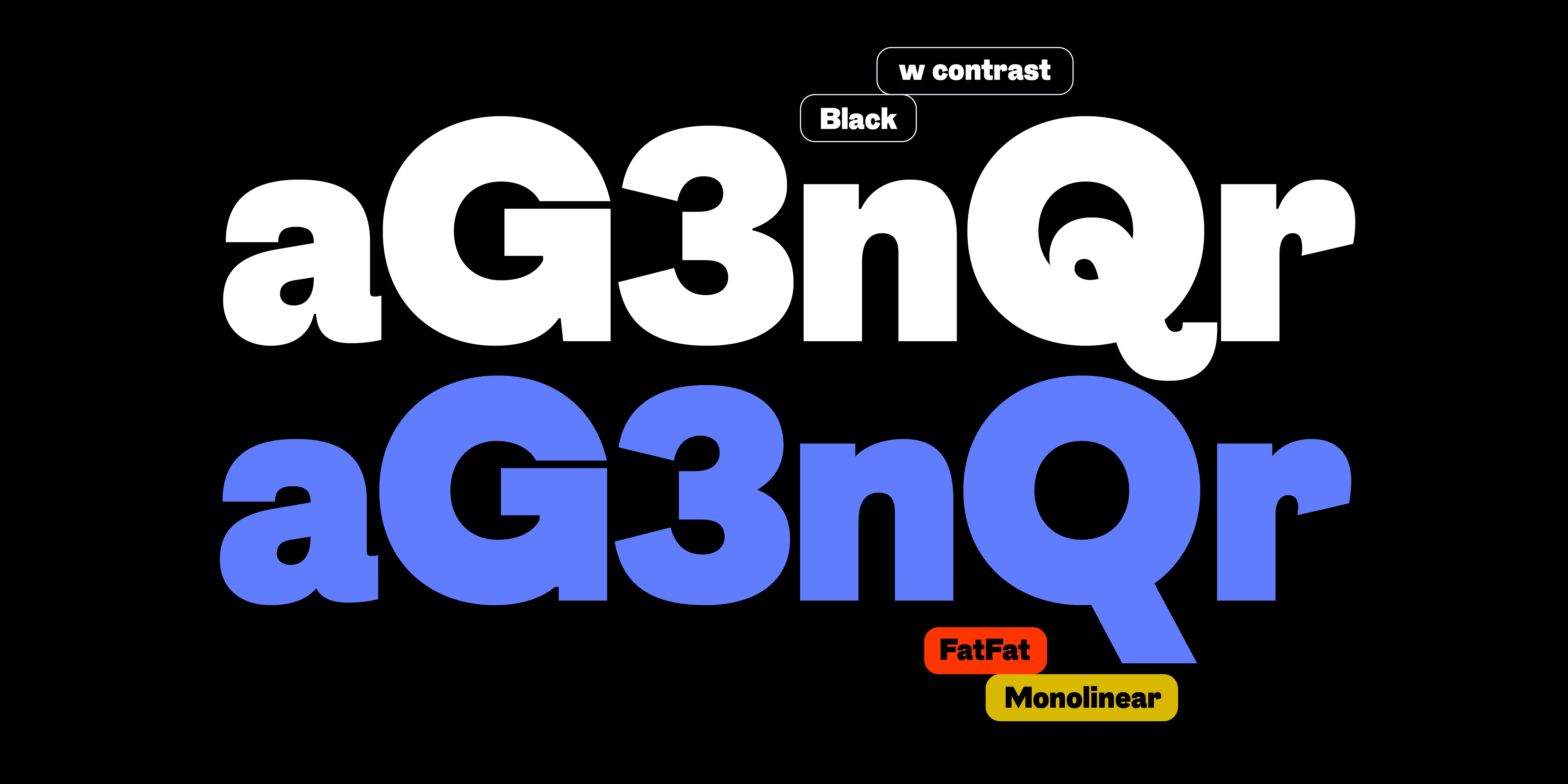
The introduction of a heavy weight is challenge in itself since it was a search for a bold design true to the existing lighter weight without a historic model. The monolinear FatFat design was added as an element of play to extend the options of typographic expression.